Matplotlib绘图
author:Leon
Date:2025年4月1日
“只有执行力,才是破除你迷茫的关键
人生有一大悲剧,就是你只知道在心中排兵布阵,生活中瞻前顾后、浑噩度日,不肯尝试、不肯付出”
前言
读者应先了解Pandas、Numpy等知识,着重了解Series与DataFrame的切片和索引操作
Numpy中的Random类:
在机器学习中,经常需要用到数据的生成或者初始值生成,以下是常用的random函数
- rand()生成的是给定大小规模且数值在[0, 1]之间均匀分布的数据,服从uniform分布
# output:
(array([0.2864762 , 0.79142124, 0.12689291]),
 array([[0.48259104, 0.95018256, 0.02271196],
        [0.06901685, 0.95803233, 0.50813958],
        [0.51934141, 0.64480197, 0.36837102]]))
- randn()生成的是给定大小规模,数值为均值为0,方差为1的正态分布数据
# output
array([[-0.09633963,  0.18687185, -0.47920484,  0.38434785],
       [ 1.24058112, -0.0617154 ,  0.34894678,  0.66300601],
       [-0.53113631,  1.43512755,  0.12257203, -0.69964025]])
- randint()生成的是给定范围内具体数目的数据
思维导图
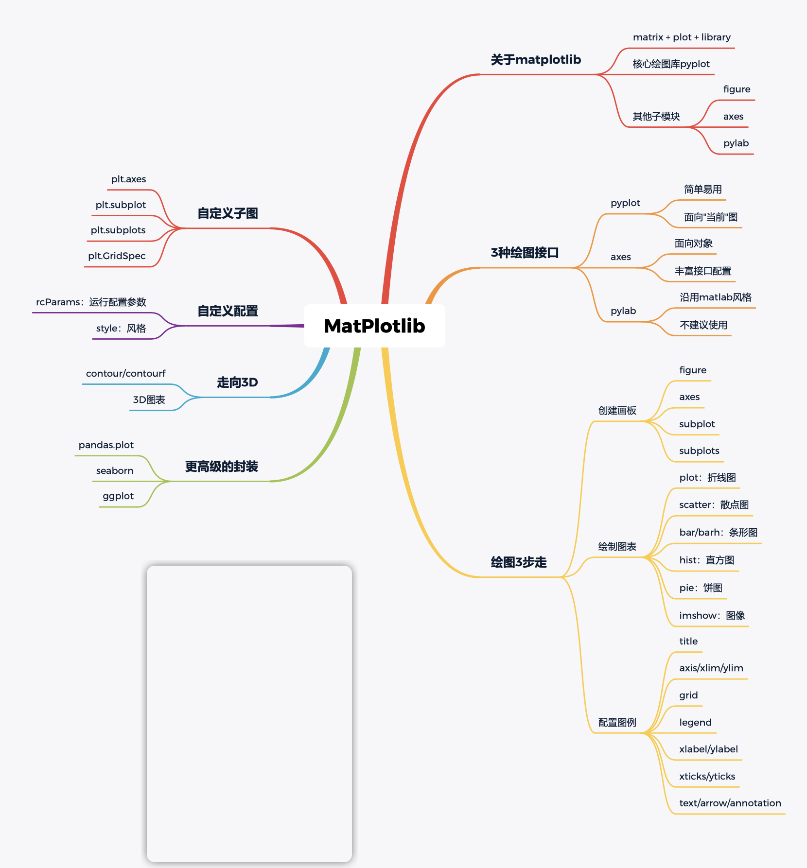
基本参数设置
# 运行时配置参数
# rcParams : runtime configuration Parameters
# 解决浏览器不显示图片
%matplotlib inline
# 让图片显示中文
plt.rcParams['font.sans-serif'] = 'SimHei'
# 让图片可以显示负号
plr.rcParams['axes.unicode_minus'] = False
# 支持svg矢量图
%config Inlinebackend.figure_format = 'svg'
# 查看本地字体库
from matplotlib.font_manager import FontManager
fm = FontManager()
my_fonts = set(f.name for f in fm ttflist)
my_fonts
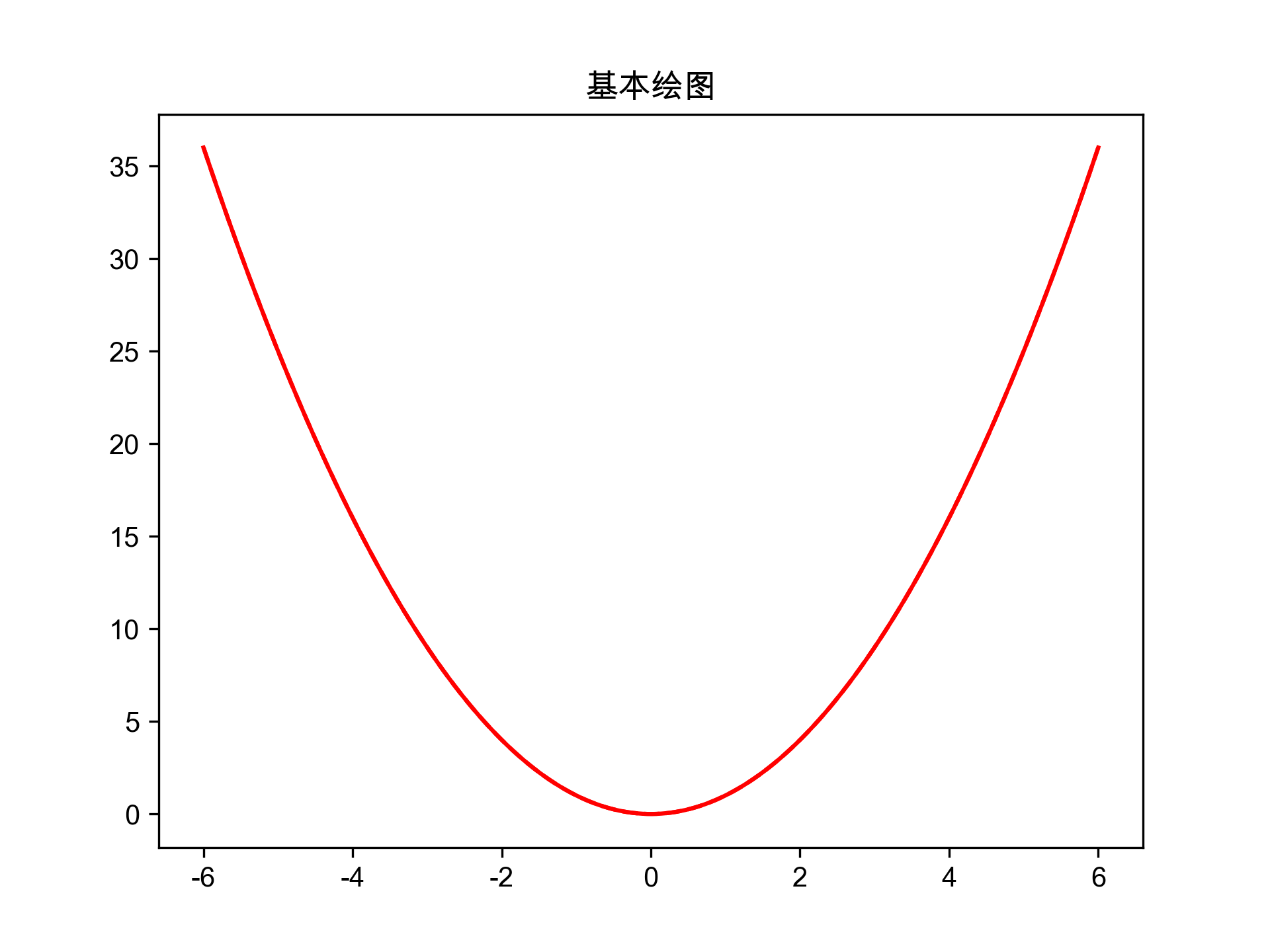
基本绘图
# 导包
import numpy as np
import pandas as pd
import matplotlib.pyplot as plt
# 准备数据
x = np.linspace(-6,6,1000000) # 等差数列 起始值 终止值 元素个数
y = x ** 2
# 设置画布大小 color 颜色 ls 线条样式
# 线条样式
# 绘图(线形图/折线图)
# - :实线
# -- :虚线
# dashdot : 点划线
# : : 点线
plt.plot(x, y, color = 'r', ls = '-')
# plt.plot(x, y, 'r--')
plt.title('基本绘图')
plt.show()
多图布局
# 导包
import pandas as pd
import numpy as np
import matplotlib.pyplot as plt
# 让图片可以显示中文
plt.rcParams['font.sans-serif'] = 'Arial Unicode MS'
# 让图片可以显示负号
plt.rcParams['axes.unicode_minus'] = False

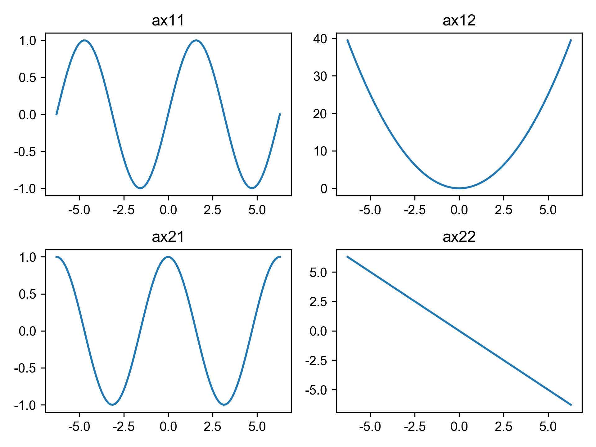
fig , ax = plt.subplots(2, 2, dpi = 300)
ax1, ax2 = ax
ax11, ax12 = ax1
ax21, ax22 = ax2

ax11.plot(x, np.sin(x))
ax12.plot(x, x ** 2)
ax21.plot(x, np.cos(x))
ax22.plot(x, -x)

ax11.set_title('ax11')
ax12.set_title('ax12')
ax21.set_title('ax21')
ax22.set_title('ax22')

fig.tight_layout()

plt.savefig('/Users/edward/PrjFile/JupyterNoteBook/Matplotlib/image/image5',
            dpi = 300)
plt.show()
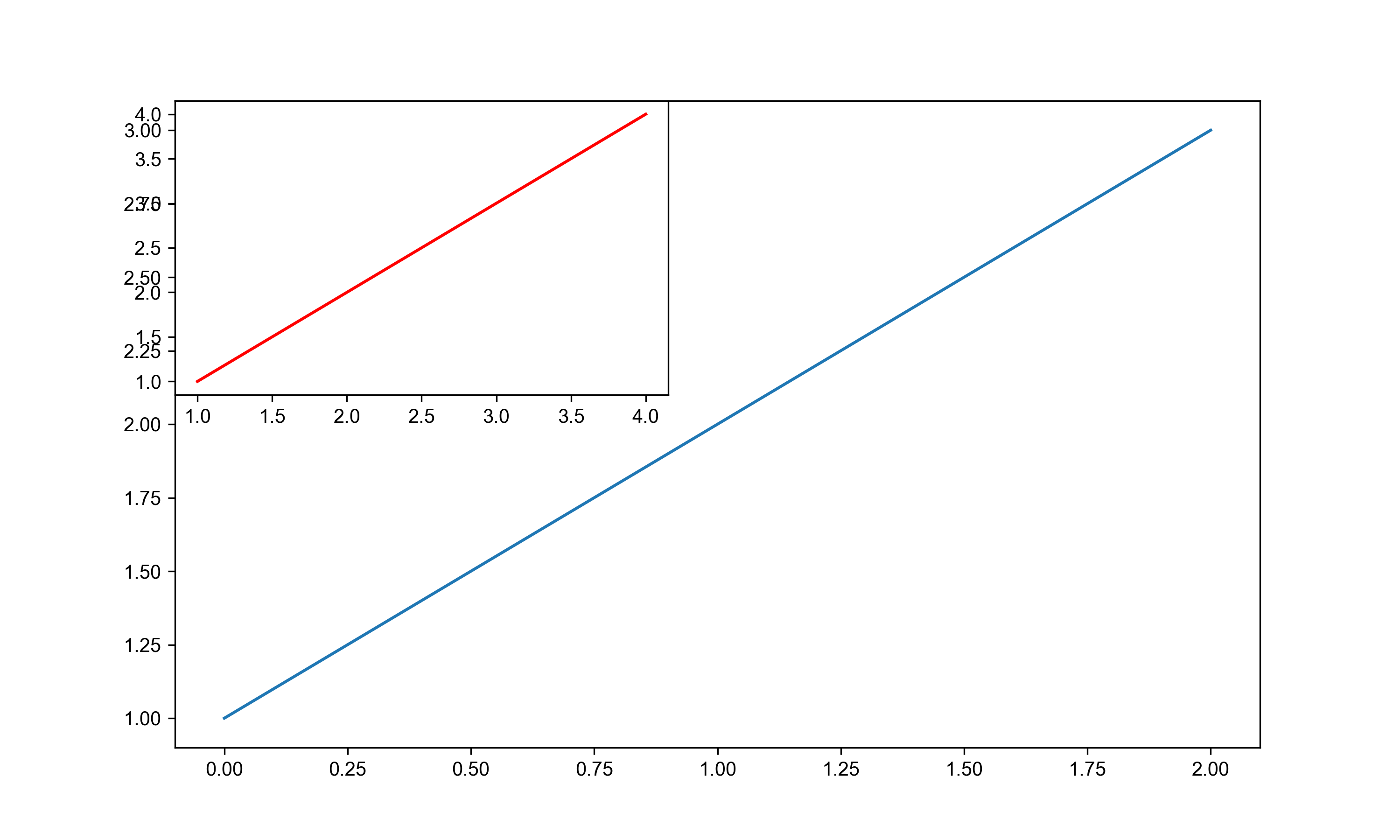
图形嵌套
# 嵌套图
fig = plt.figure(figsize = (10,6))
#子图1
axes1 = fig.add_subplot(1,1,1)
axes1.plot([0, 1, 2], [1, 2, 3])

# 子图2 嵌套图 add_subplot()
axes2 = fig.add_subplot(2, 2, 1)
x = [1,2,3,4]
y = x
axes2.plot(x, y, color = 'red')
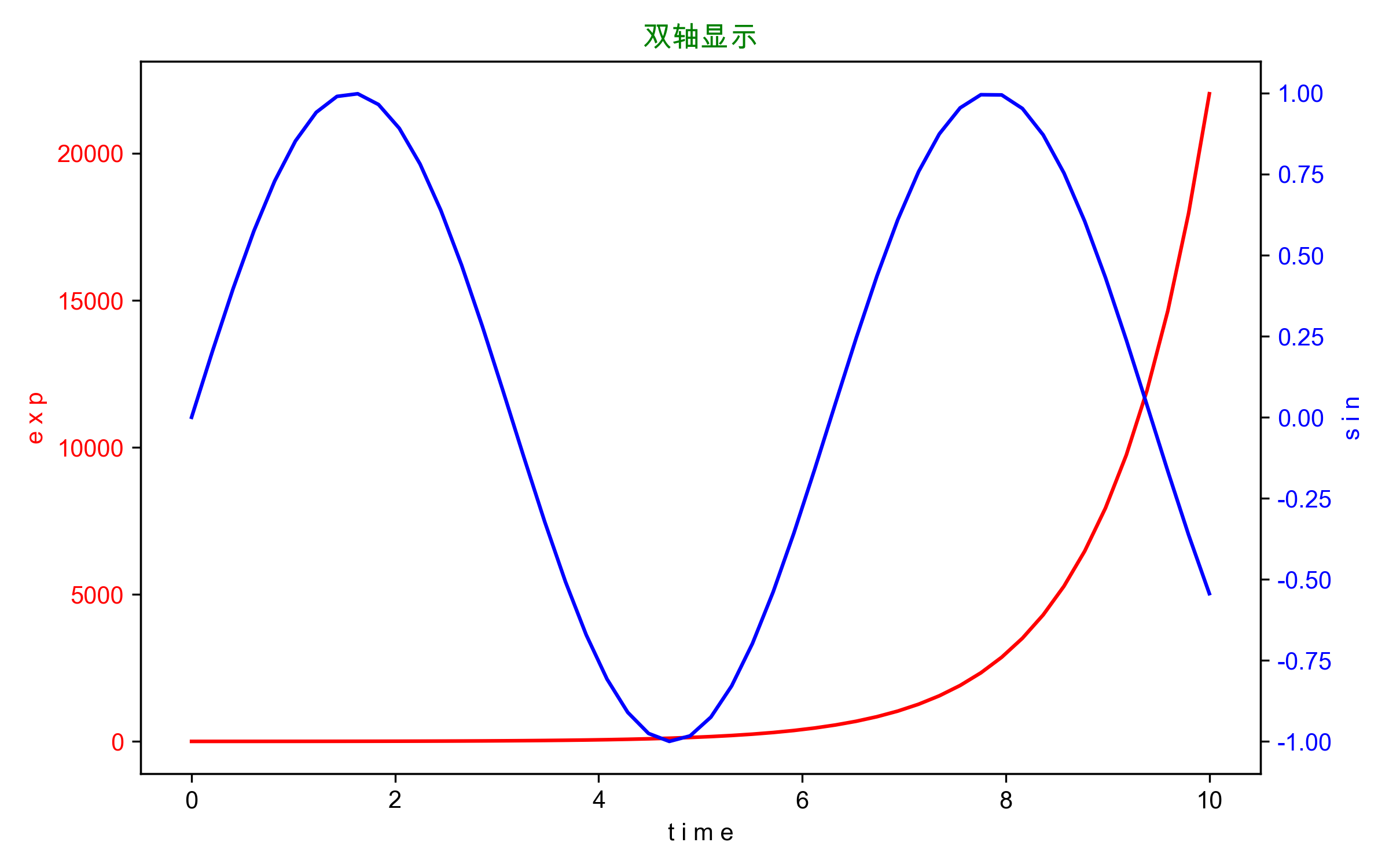
双轴显示
# 设置画布、准备数据
fig = plt.figure(figsize = (8, 5))
x = np.linspace(0,10,50)

# 绘制图1
axes1 = plt.gca() # 得到当前轴域
axes1.plot(x, np.exp(x), c= 'r')
axes1.set_xlabel('t i m e')
axes1.set_ylabel('e x p', c = 'r') # 设置图1的y轴标签
axes1.tick_params('y', labelcolor = 'r') # 设置y轴的属性,改变颜色

# 绘制图2
axes2 = axes1.twinx() # 和图1共享x轴
axes2.plot(x, np.sin(x), c = 'blue')
axes2.set_ylabel('s i n', c = 'blue')
axes2.tick_params('y', labelcolor = 'b')

plt.title('双轴显示', c = 'g')
plt.tight_layout() # 自动调整布局
常用绘图属性
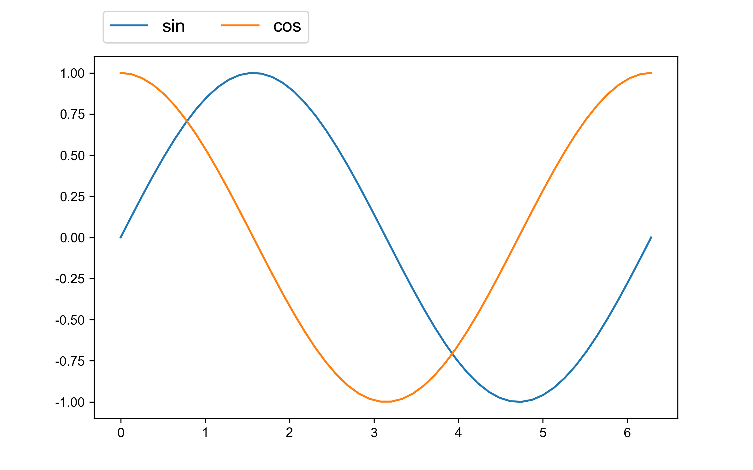
1.图例
# 图例 legend
fig = plt.figure(figsize = (8, 5) )
x = np.linspace(0, 2 * np.pi, 50)
axes1 = plt.plot(x, np.sin(x), label = 'sin') # 设置图例
axes2 = plt.plot(x, np.cos(x) ,label = 'cos') # 设置图例

plt.legend(
          fontsize = 14,
          loc = 'upper left', # 图例的位置
          ncol = 2, # 显示成n列,默认1列
          bbox_to_anchor = [0, 1, 1, 0.15] # 图例的具体位置(x, y, width, height)
          )
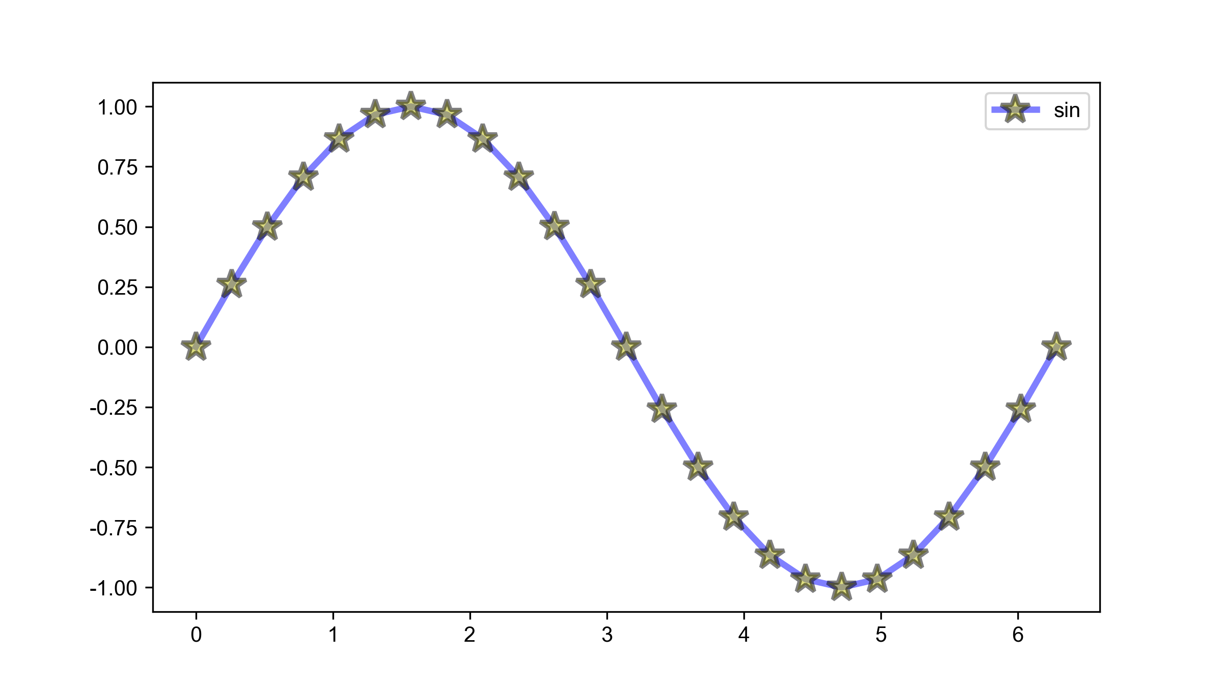
2.颜色&样式
fig = plt.figure(figsize = (8,4.5))
x = np.linspace(0, 2 * np.pi, 25)
plt.plot(x, np.sin(x),
         color = 'b',
         linestyle = '-',
         linewidth = 3,
         alpha = 0.5, # 透明度
         marker = '*',
         mfc = 'y', # 标记的背景颜色 marker face color
         label = 'sin',  # 配合图例使用
         markersize = 14, # 标记大小
         markeredgecolor = 'k', # 标记的边缘颜色
         markeredgewidth = 2 # 标记的边缘宽度
        )
plt.legend()
plt.savefig('/Users/edward/PrjFile/JupyterNoteBook/Matplotlib/image/image8',
            dpi = 300)
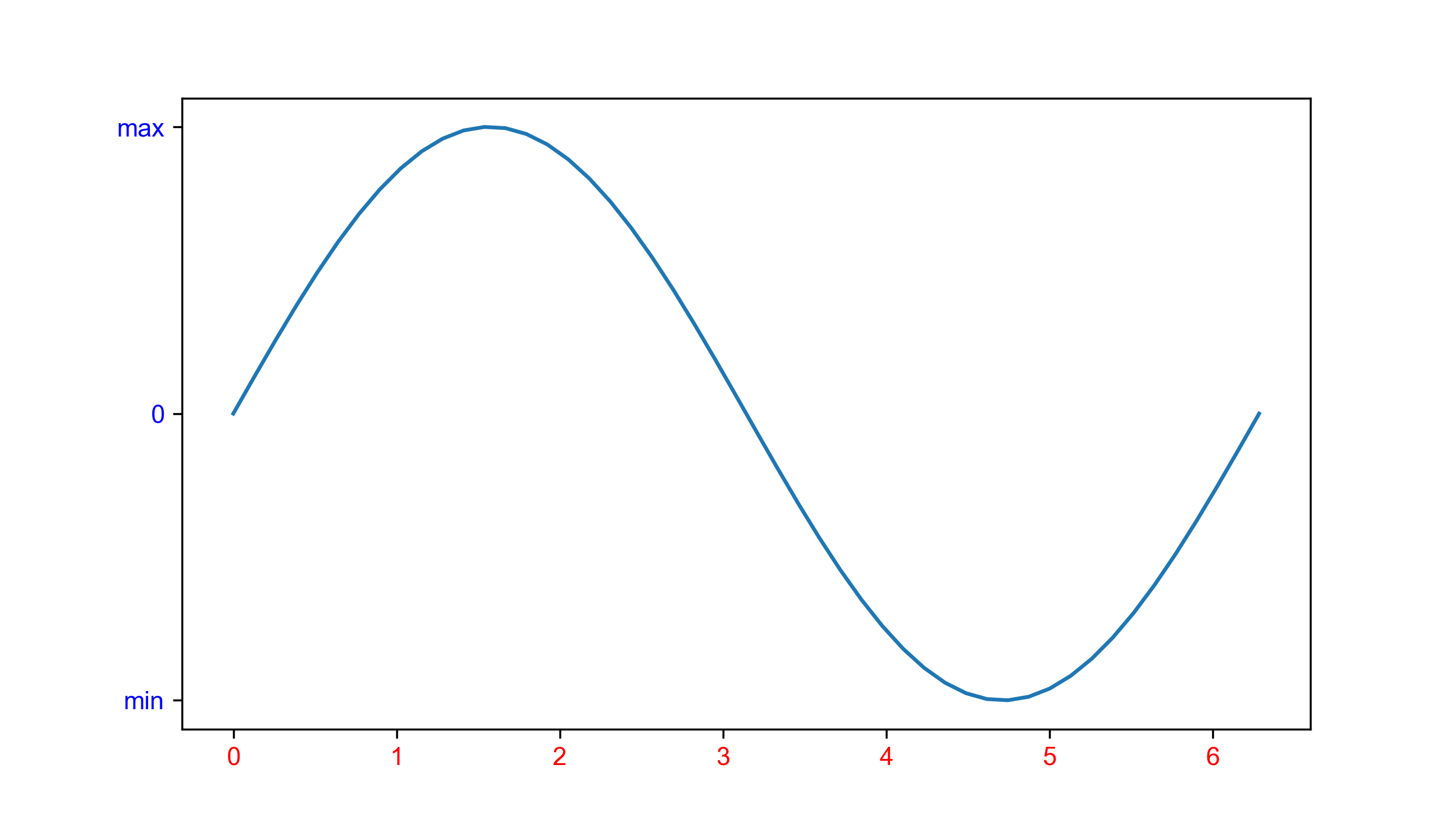
3.坐标轴刻度
xticks() & yticks()
fig = plt.figure(figsize = (8,4.5))
x = np.linspace(0, 2 * np.pi, 50)
plt.plot(x, np.sin(x))
plt.xticks(
            ticks = np.arange(0, 7, 1),
            fontsize = 10,
            color = 'r'
          )

plt.yticks(
            ticks = [-1, 0, 1],
            labels = ['min', '0', 'max'],
            color = 'b',
            ha = 'right' # 水平对齐方式
)
plt.show()
4.坐标轴范围与配置
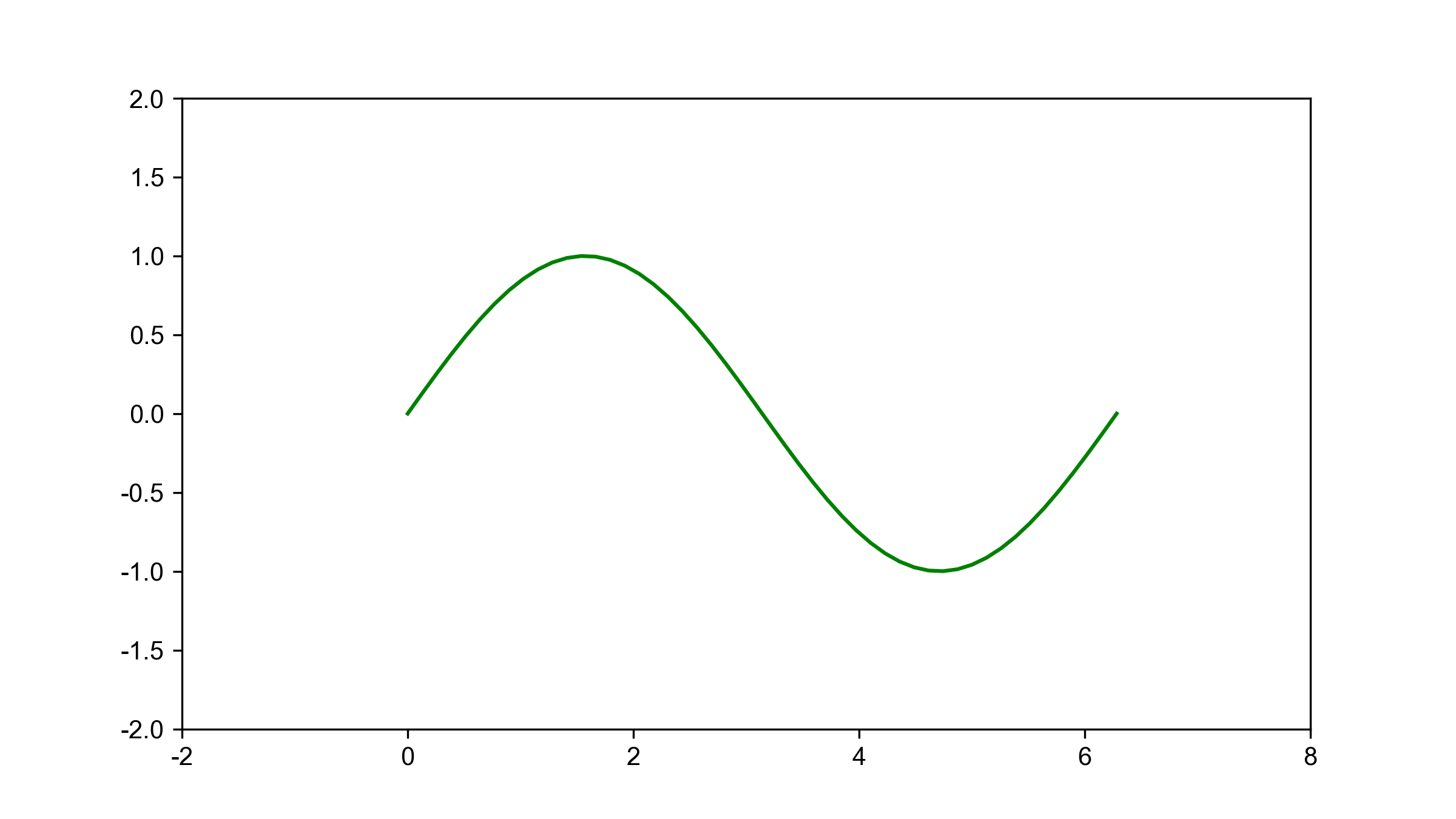
自定义坐标轴范围:
- xlim() & ylim()
- axis()
# xlim() & ylim()写法
fig = plt.figure(figsize = (8, 4.5))
x = np.linspace(0, 2* np.pi, 50)
plt.plot(x, np.sin(x), c = 'g')
plt.xlim(-2, 8)
plt.ylim(-2, 2)
plt.show()

#axis()写法
plt.axis([-2, 8, -2, 2]) # [xmin, xmax, ymin, ymax]
axis()中的option参数
- off 不显示坐标轴
- equal 让x、y轴的刻度距离相同
- scaled 自动缩放坐标轴和图片适配
- tight 紧凑自动适配图片
- square 让画布呈现正方形,x、y轴宽高一致
5.标题&网格线
标题 plt.title() :
- 文本内容
- fontsize 字体大小
- color 字体颜色
- loc 位置 left , center , right
# 标题
plt.title(
    'sin',
    fontsize = 20, # 字体大小
    color = 'g',  # 字体颜色
    loc = 'center' # 位置 left、center、right
)
父标题 plt.suptitle():
- 文本内容
- fontsize 字体大小
- x 指定水平方向的位置,默认居中
- y 指定垂直方向的位置,默认居中
网格线 plt.grid():
- linestyle (ls) 线条样式
- linewidth (lw) 线条宽度
- color (c)线条颜色
- axis 指定单轴显示网格线,默认双轴显示
# 网格线
# ls 网格线的样式
# lw 网格线的宽度
# c 网格线的颜色
# axis 指定单轴显示网格线
plt.grid(
ls = '--',
linewidth = 0.5,
c = 'grey',
axis = 'y'
)
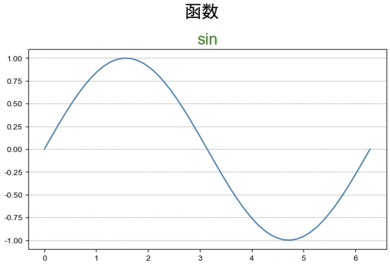
# 标题与副标题
fig = plt.figure(figsize = (8, 4.5))
x = np.linspace(0, 2* np.pi, 50)
y = np.sin(x)
plt.plot(x, y)
# 标题
plt.title(
'sin',
fontsize = 20, # 字体大小
color = 'g', # 字体颜色
loc = 'center' # 位置 left、center、right
)
# 父标题
plt.suptitle(
    '函数',
    fontsize = 22,
    y = 1.05 # 指定垂直方向的位置,水平方向用x指定,默认居中
)
# 网格线
# ls 网格线的样式
# lw 网格线的宽度
# c 网格线的颜色
# axis 指定单轴显示网格线
plt.grid(
    ls = '--',
    linewidth = 0.5,
    c = 'grey',
    axis = 'y'
)
plt.show()
6.标签
plt.xlabel() & plt.ylabel()
- 标签文本
- fontsize 文本大小
- rotation 角度
- horizontalalignment 对齐方式
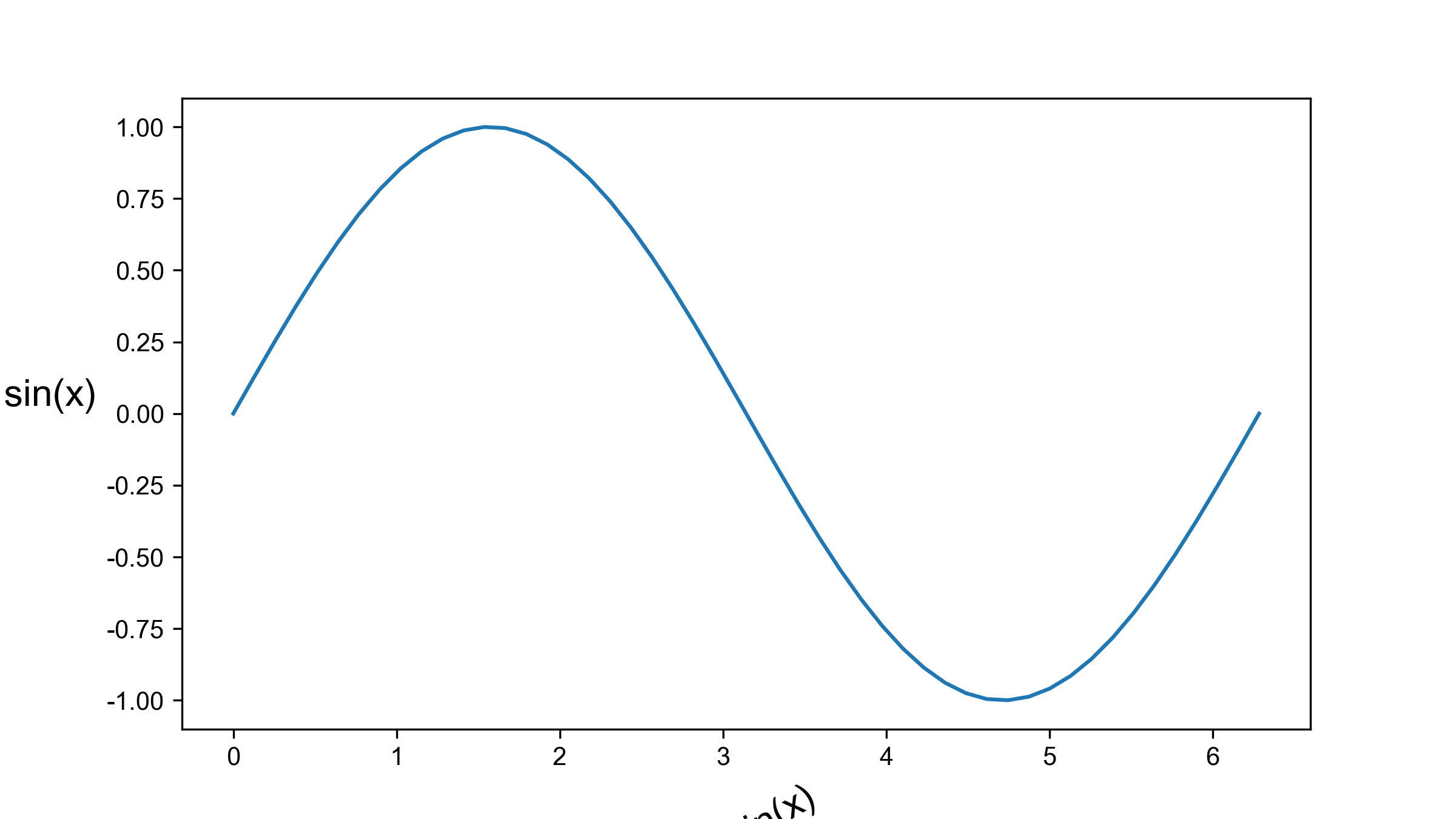
# 标签
fig = plt.figure(figsize = (8, 4.5))
x = np.linspace(0, 2* np.pi, 50)
y = np.sin(x)
plt.plot(x, y)
plt.xlabel(
    'y = sin(x)',
    fontsize = 15,
    rotation = 30 # 角度
)
plt.ylabel(
    'y = sin(x)',
    fontsize = 15,
    rotation = 0, # 角度,y轴默认为90
    horizontalalignment = 'right' # 设置对齐方式
)
plt.show()
7.画文本
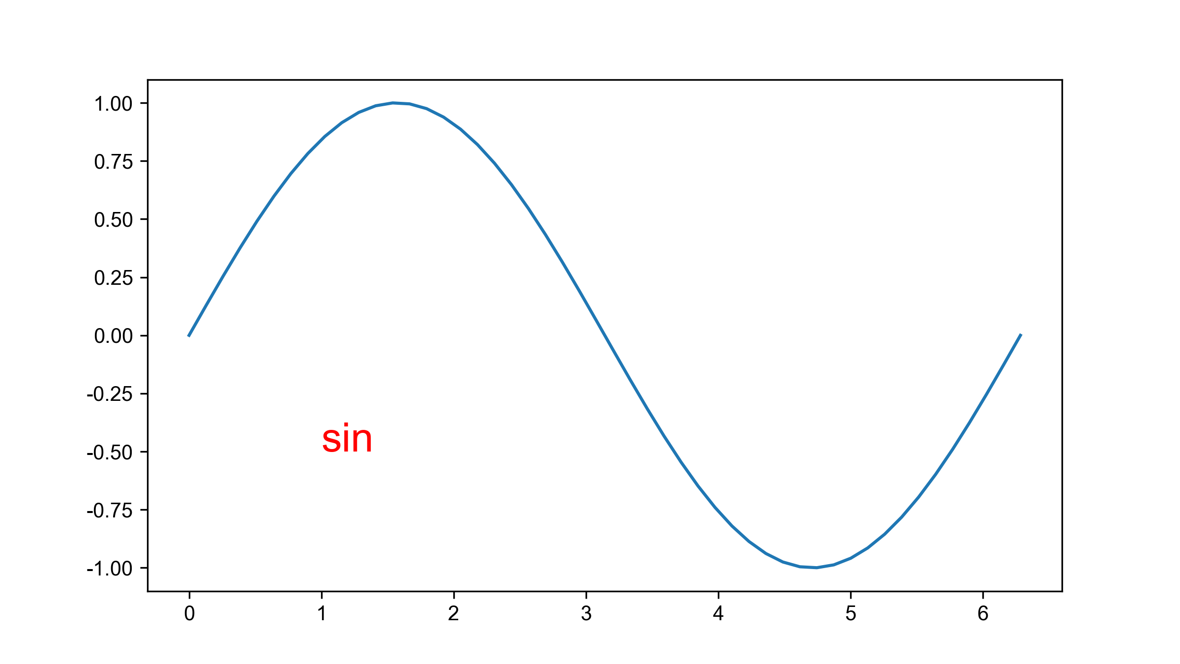
# 画文本
fig = plt.figure(figsize = (8, 4.5))
x = np.linspace(0, 2* np.pi, 50)
y = np.sin(x)
plt.plot(x, y)
plt.text(x = 1, y = -0.5, s = 'sin', fontsize = 20, c = 'red') # 指定位置添加文本
plt.show()
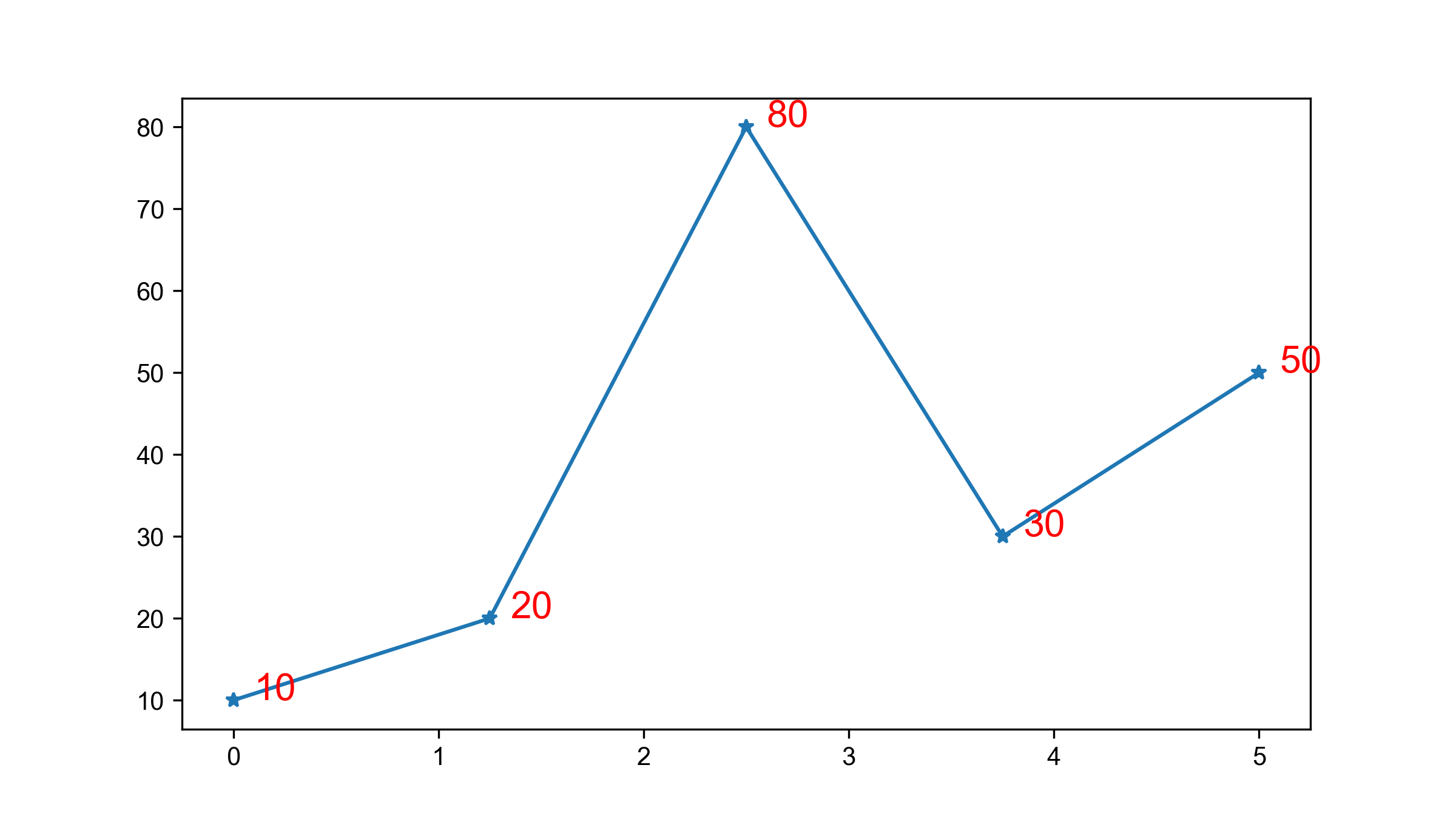
利用循环对每个点进行文本标记
fig = plt.figure(figsize = (8, 4.5))
x = np.linspace(0, 5, 5)
y = np.array([10, 20, 80, 30, 50])
plt.plot(x, y, marker = '*')
for a,b in zip(x,y):
    plt.text(
        x = a + 0.1,
        y = b,
        s = b,
        c = 'red',
        fontsize = 15,
        # ha = 'center',
        # va = 'center'
    )
plt.show()
8.绘制参考线 & 参考区域
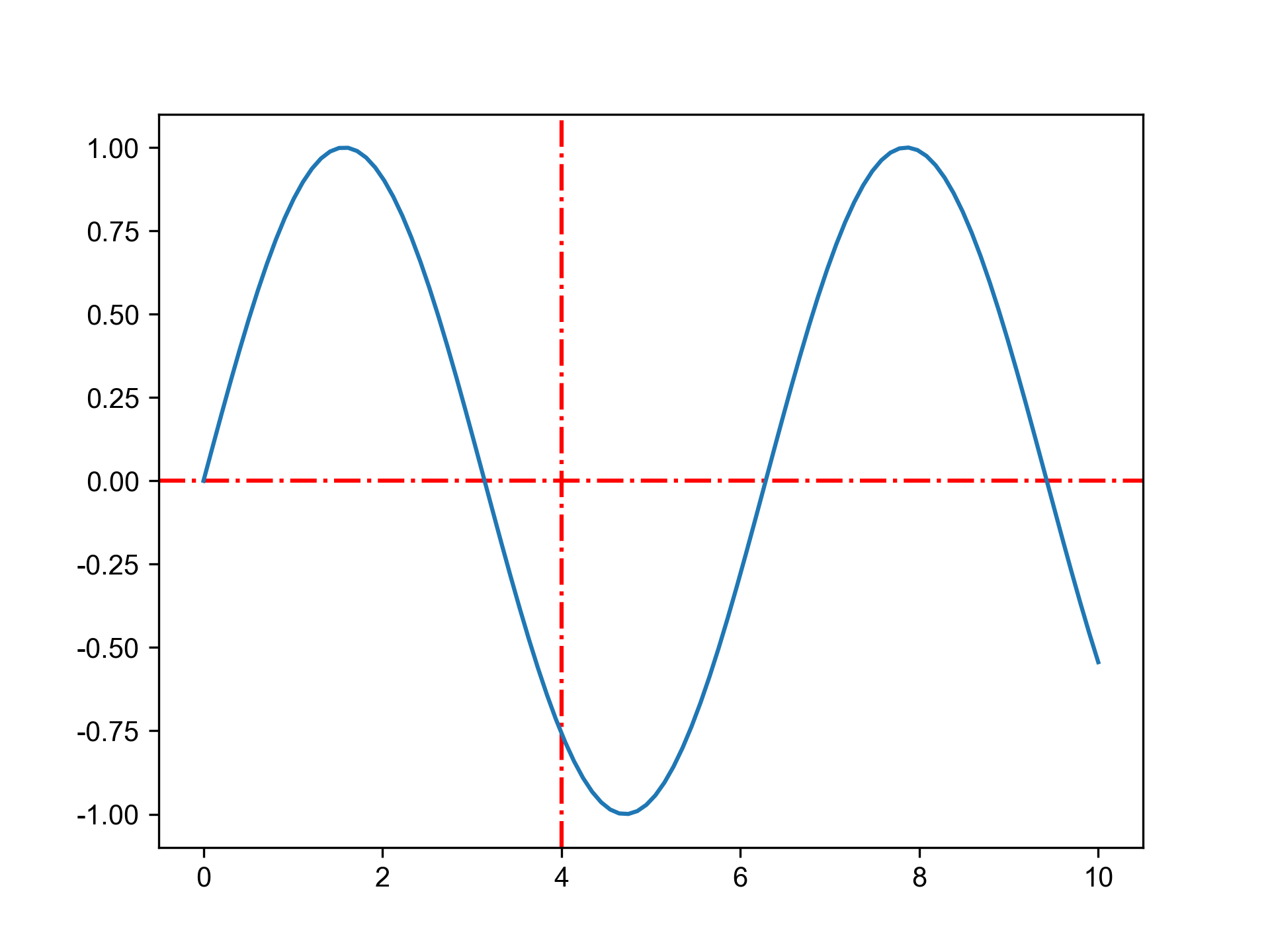
参考线:
-
axhline() 绘制水平参考线 horizontal
-
axvline() 绘制垂直参考线 vertical
x = np.linspace(0, 10, 100)
y = np.sin(x)
# 绘制参考线
horizontal 水平的
vertical 垂直的
plt.axhline(y = 0, ls = '-.', c = 'r') # 绘制水平参考线
plt.axvline(x = 4, ls = '-.', c = 'r') # 绘制垂直参考线
plt.plot(x, y)
plt.show()
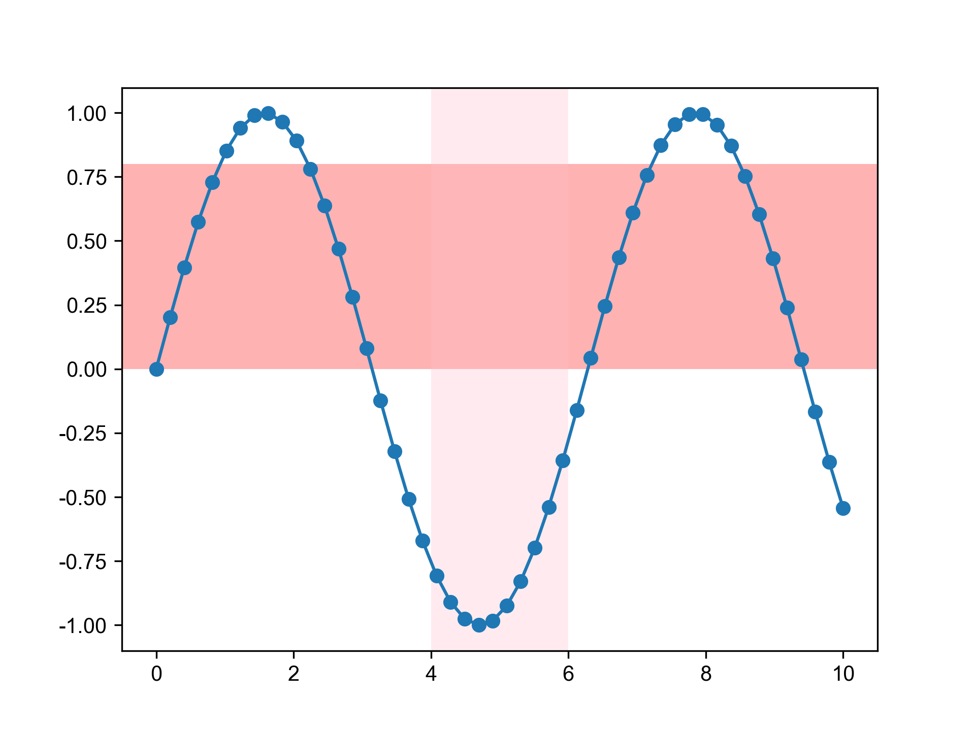
参考区域:
x = np.linspace(0, 10, 50)
y = np.sin(x)
# 绘制参考区域
plt.axhspan(ymin = 0, ymax = 0.8, facecolor = 'r', alpha = 0.3)
plt.axvspan(xmin = 4, xmax = 6, facecolor = 'pink', alpha = 0.3)
plt.plot(x, y, marker = 'o')
plt.savefig('/Users/edward/PrjFile/JupyterNoteBook/Matplotlib/image/image32.png', dpi = 300)
plt.show()
9.注释标注&保存图片
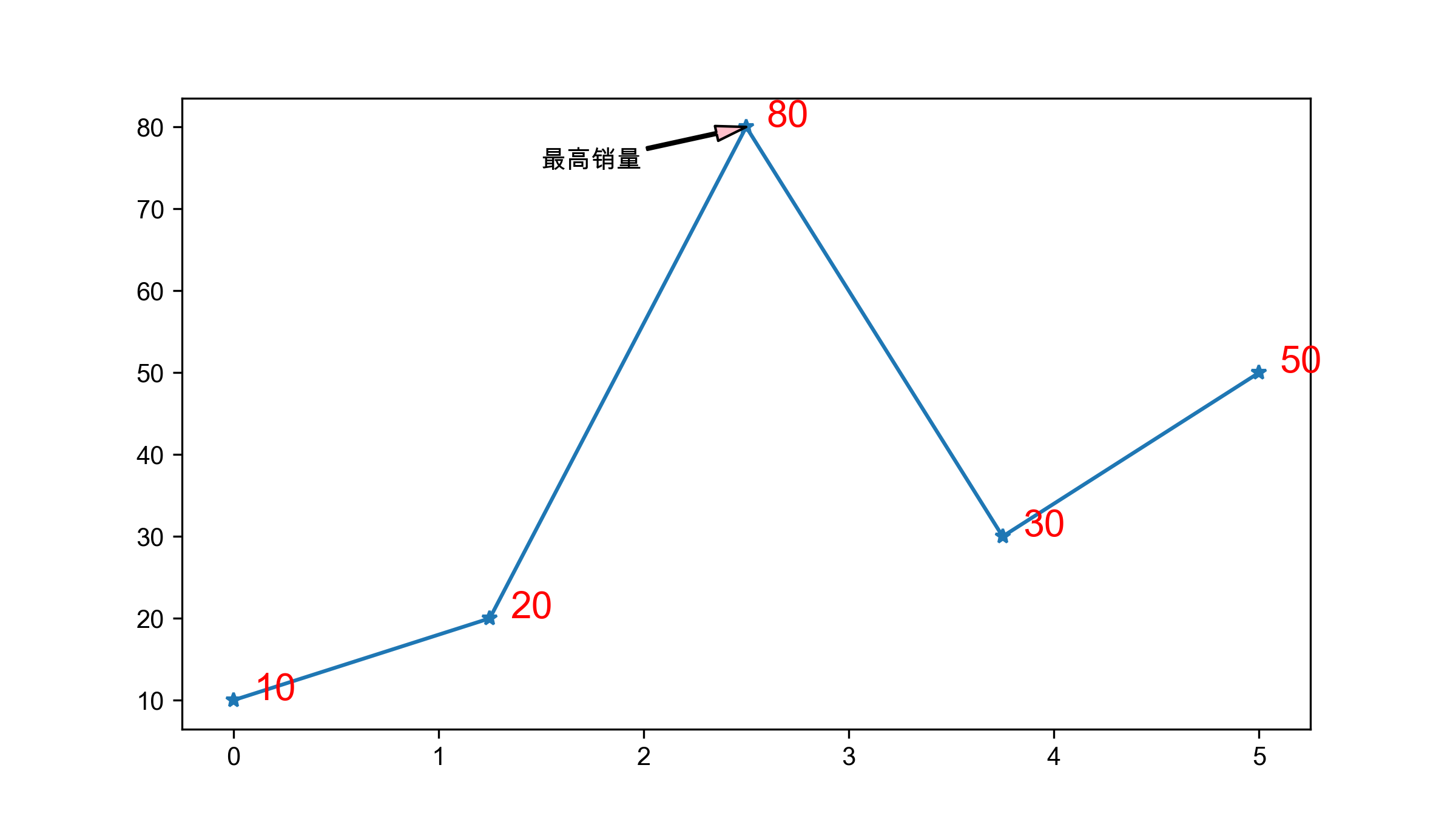
# 注释
fig = plt.figure(figsize = (8, 4.5))
x = np.linspace(0, 5, 5)
y = np.array([10, 20, 80, 30, 50])
plt.plot(x, y, marker = '*')
for a,b in zip(x,y):
    plt.text(
        x = a + 0.1,
        y = b,
        s = b,
        c = 'red',
        fontsize = 15,
        # ha = 'center',
        # va = 'center'
    )
plt.annotate(
    text = '最高销量', # 文本内容
    xy = (2.5, 80), # 标注的坐标点,箭头指向的位置
    xytext = (1.5, 75), # 标注内容的位置
    arrowprops = {
        'width' : 1, # 箭头线的宽度
        'headwidth' : 6, # 箭头头部的宽度
        'facecolor' : 'pink' # 箭头的背景颜色
    }
)
plt.show()
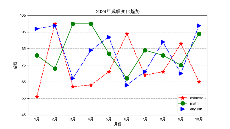
1.折线图
应用场景:数据在一个有序的因变量上的变化,它的特点是反应实物随类别变化而变化的趋势,可以清晰展现数据的增减趋势、速率、规律以及峰值等特征。
优点:
- 能很好的展现沿某个唯独的变化趋势
- 能比较多组数据在同一个纬度上的趋势
- 适合展现较大的数据集
import matplotlib.pyplot as plt
import numpy as np
import pandas as pd

data = {
    '月份': ['1月', '2月', '3月', '4月', '5月', '6月', '7月', '8月', '9月', '10月'],
    '语文': [56, 100, 62, 63, 71, 94, 69, 71, 88, 65],
    '数学': [81, 73, 100, 100, 82, 67, 84, 81, 75, 94],
    '英语': [97, 99, 67, 84, 92, 63, 71, 89, 70, 99]
}
grade_df = pd.DataFrame(data)
grade_df


# 绘制三门科目的成绩

#绘制画板
plt.figure(figsize = (8,4.5))

# 准备数据
x = grade_df['月份']
y_chinese = grade_df['语文']
y_math = grade_df['数学']
y_english = grade_df['英语']

plt.plot(x, y_chinese, c = 'red', ls = '--', label = 'chinese', marker = '*', ms = 10)
plt.plot(x, y_math, c = 'green', ls = '-', label = 'math', marker = 'o', ms = 10)
plt.plot(x, y_english, c = 'blue', ls = '-.', label = 'english', marker = '>', ms = 10)

plt.yticks(range(45 ,110, 10))

plt.ylabel('成绩')
plt.xlabel('月份')
plt.title('2024年成绩变化趋势')
plt.legend()
plt.grid(axis = 'y', ls = '--')


plt.show()
2.柱状图&条形图
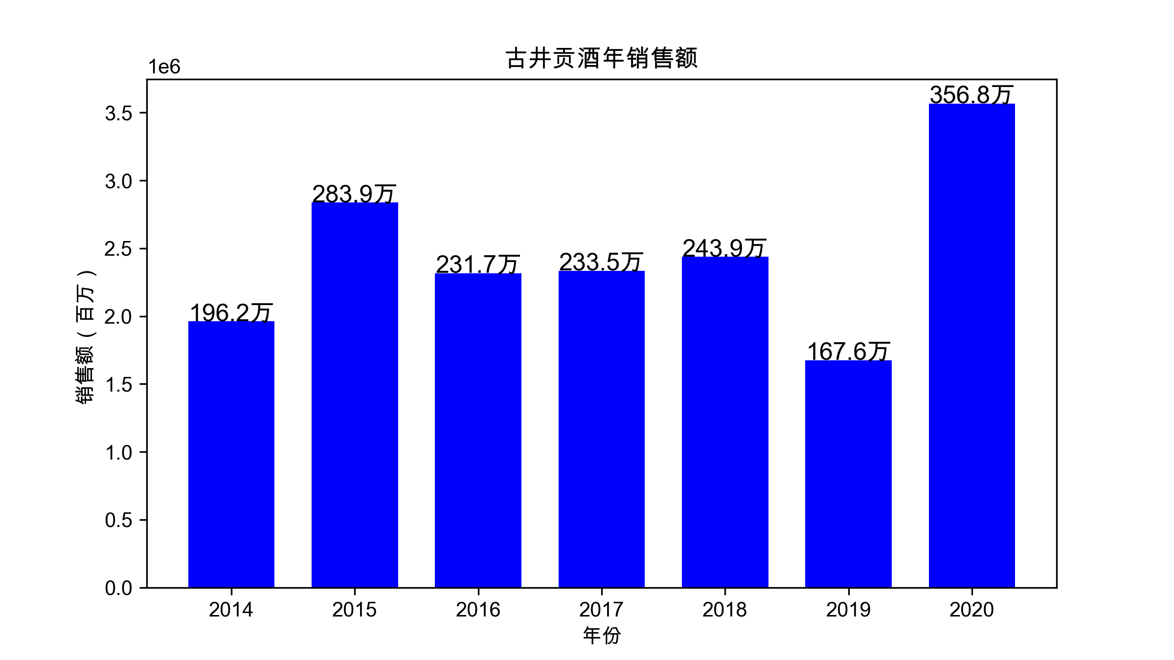
应用场景:
适合用于展示二维数据集,展示数据的分布情况,其中一个轴表示需要对比的分类纬度,另一个轴代表相应的数值,或者在同一纬度下,对多个同质可比较的指标进行比较,但并不适合较大数据集的展现
优点:
- 简单直观,容易根据柱子的长短看出值的大小
- 易于比较各组数据之间的差别
柱状图也可衍生出簇状图、堆叠柱状图、条形图(即水平方向的柱状图)
# 导包 & 配置
import pandas as pd
import numpy as np
import matplotlib.pyplot as plt
# 让图片可以显示中文
plt.rcParams['font.sans-serif'] = 'Arial Unicode MS'
# 让图片可以显示负号
plt.rcParams['axes.unicode_minus'] = False
# 柱状图

# 数据准备
data = {
    '年份': [2014, 2015, 2016, 2017, 2018, 2019, 2020],
    '销售额': [1962035, 2838693, 2317447, 2335002, 2438570, 1675591, 3568120]
}
df = pd.DataFrame(data)

plt.figure(figsize = (8, 4.5))
x = df['年份']
y = df['销售额']

plt.bar(x, y, width = 0.7, color = 'blue')
plt.ylabel('销售额(百万)')
plt.xlabel('年份')
plt.title('古井贡酒年销售额')
for a,b in zip(x, y):
    plt.text(
        a,
        b + 1,
        s = '{:.1f}万'.format(b / 10000), # 数字缩写方法
        ha = 'center',
        fontsize = 12
    )

plt.show()
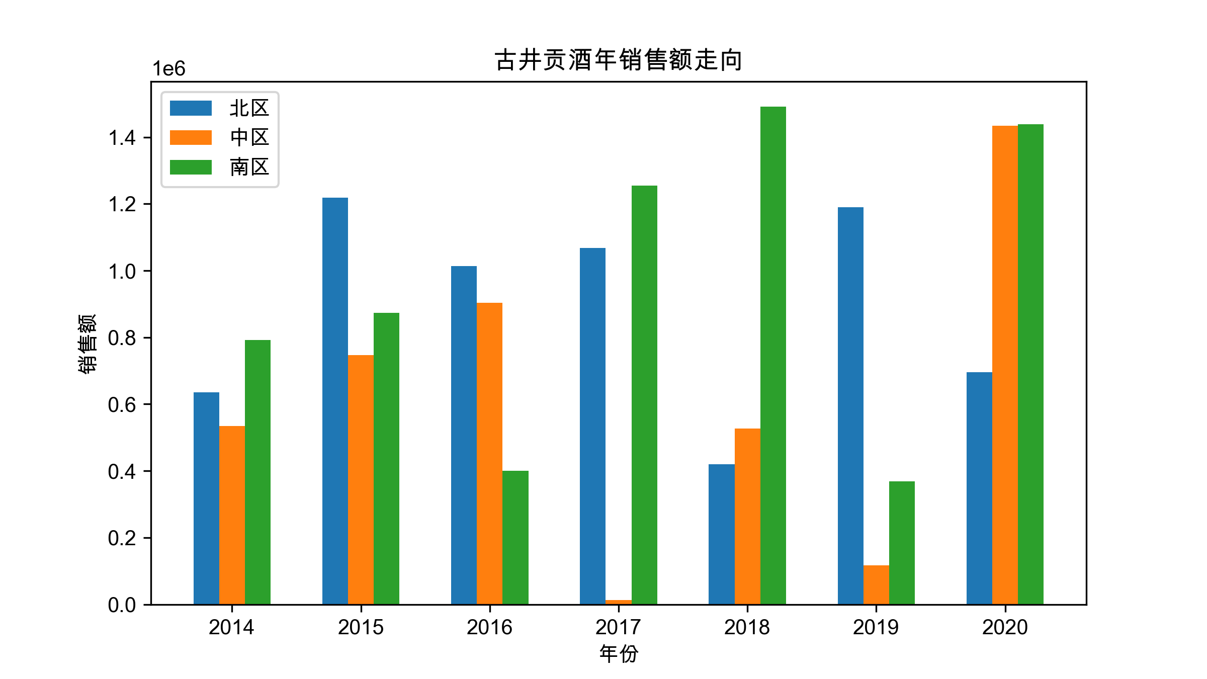
簇状图:
# 导包 & 配置
import pandas as pd
import numpy as np
import matplotlib.pyplot as plt
# 让图片可以显示中文
plt.rcParams['font.sans-serif'] = 'Arial Unicode MS'
# 让图片可以显示负号
plt.rcParams['axes.unicode_minus'] = False
# 数据准备
data = {
    '年份': [2014, 2015, 2016, 2017, 2018, 2019, 2020],
    '北区': [634704, 1218844, 1013322, 1068521, 419352, 1190076, 695421],
    '中区': [534917, 746554, 904058, 12269, 526985, 117510, 1433961],
    '南区': [792414, 873295, 400067, 1254212, 1492233, 368005, 1438738]
}
df = pd.DataFrame(data)

# 绘图
plt.figure(figsize = (8, 4.5))

x , y1, y2, y3 = df.年份, df.北区, df.中区, df.南区
w = 0.2
# width 指定柱状图的宽度
plt.bar(x - w , y1, width = w, label = '北区')
plt.bar(x, y2, width = w, label = '中区')
plt.bar(x + w, y3, width = w, label = '南区')


plt.xlabel('年份')
plt.ylabel('销售额')
plt.title('古井贡酒年销售额走向')
plt.legend()
plt.show()
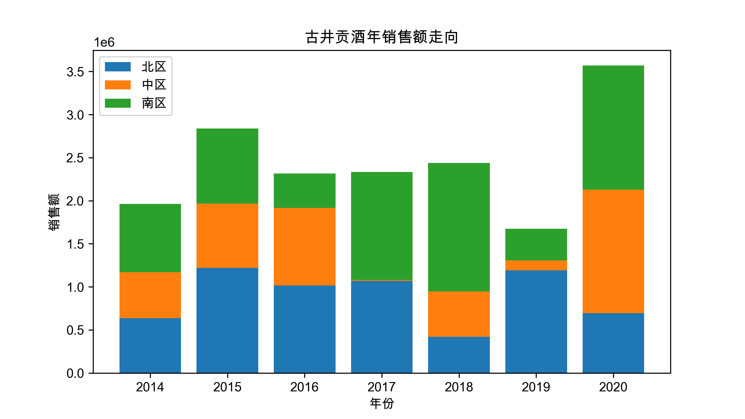
堆叠柱状图:
plt.figure(figsize = (8, 4.5))

x ,y1, y2, y3 = df.年份, df.北区, df.中区, df.南区

# 参数bottom
plt.bar(x, y1, label = '北区') # y1正常绘制
plt.bar(x, y2, label = '中区', bottom = y1) # y2在y1值的基础上绘制
plt.bar(x, y3, label = '南区', bottom = y1 + y2) # y3在(y1 + y2)值的基础上绘制

# 左脚踩右脚,故称堆叠

plt.xlabel('年份')
plt.ylabel('销售额')
plt.title('古井贡酒年销售额走向')
plt.legend()
plt.show()
条形图:
x, y1 = df.年份, df.北区
plt.figure(figsize = (10, 6))
plt.barh(x, y1)
plt.title('古井贡酒销售额走向')
plt.xlabel('销售额(亿)')
plt.ylabel('年份')
plt.show()
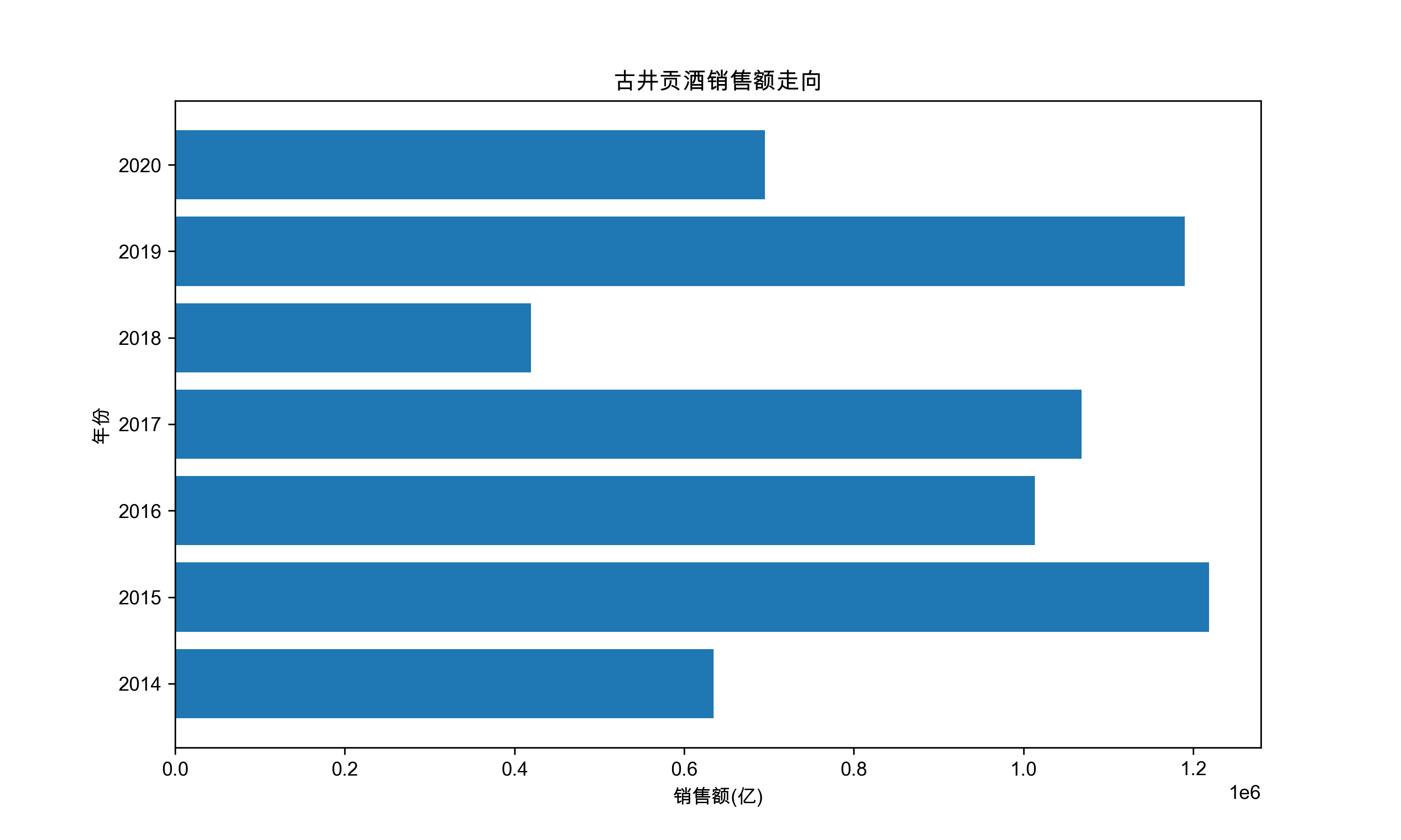
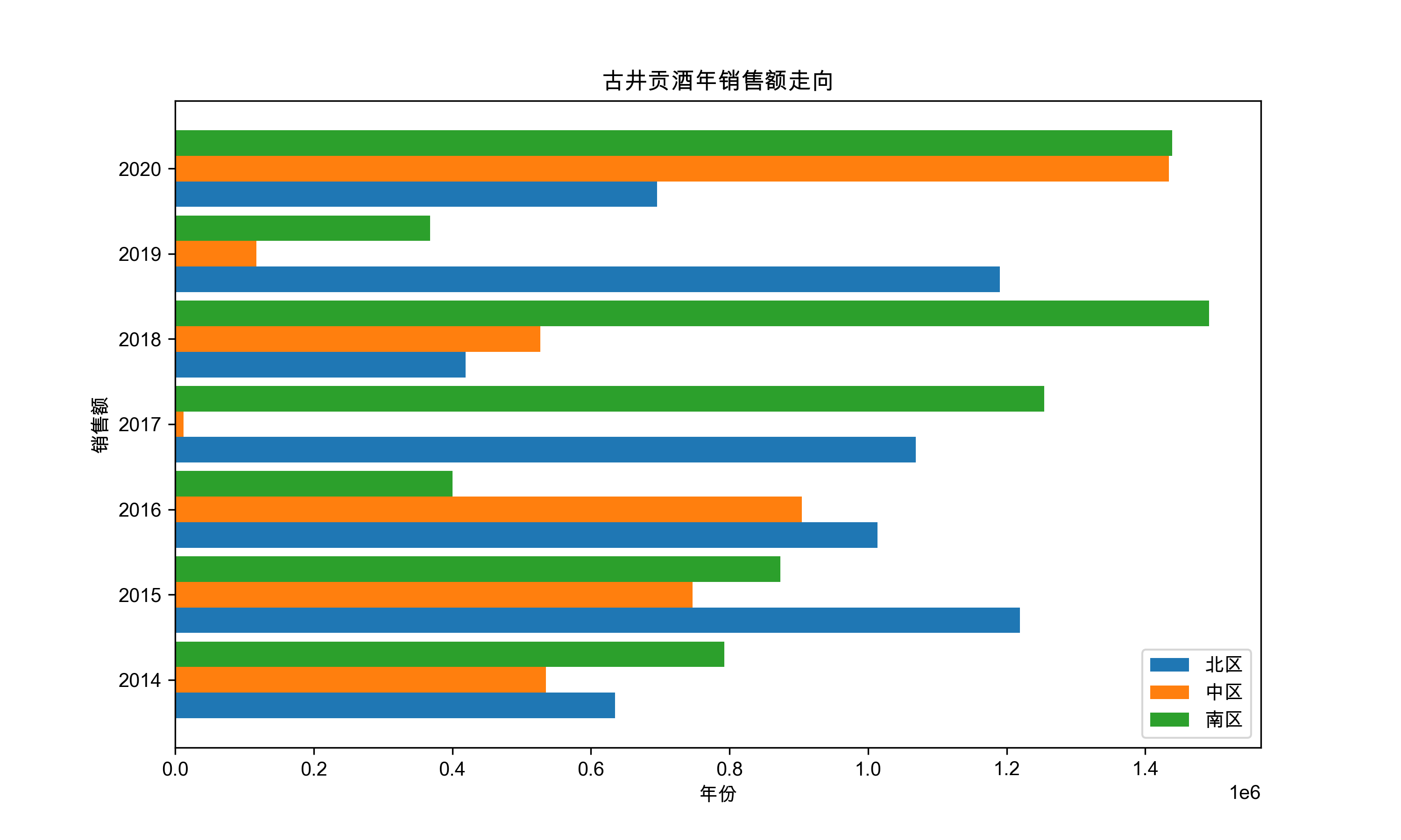
举一反三,我们很容易就能把簇状图和条形图结合起来:
# 条形簇状图
plt.figure(figsize = (10, 6))
x ,y1, y2, y3 = df.年份, df.北区, df.中区, df.南区
w = 0.3
# 与簇状图不同的是,参数width改为了height
plt.barh(x - w, y1, height = w, label = '北区')
plt.barh(x, y2, height = w, label = '中区')
plt.barh(x + w, y3, height = w,label = '南区')

plt.xlabel('年份')
plt.ylabel('销售额')
plt.title('古井贡酒年销售额走向')
plt.legend()
plt.show()
3.直方图
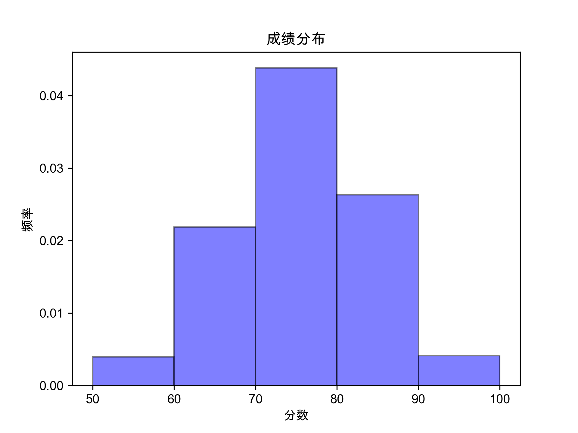
直方图,又称质量分布图,是柱形图的一种,由一系列高度不等的纵向线段来表示数据的分布情况。直方图的横轴表示数据类型,纵轴表示分布情况,直方图用于概率分布,显示了一组数值序列在给定的数值范围内出现的概率或次数
# 导包
import pandas as pd
import numpy as np
import matplotlib.pyplot as plt
# 让图片可以显示中文
plt.rcParams['font.sans-serif'] = 'Arial Unicode MS'
# 让图片可以显示负号
plt.rcParams['axes.unicode_minus'] = False

# 获取Excel数据
data = pd.read_excel('data/plot.xlsx', sheet_name = 'hist')
data.head()

x = data.分数
plt.hist(x,
         bins = [50, 60, 60, 70, 80, 90, 100],
         facecolor = 'blue',
         alpha = 0.5,
         edgecolor = 'k',
         density = True
        )
plt.xlabel('分数')
plt.ylabel('频率')
plt.title('成绩分布')
plt.show()
4.箱形图
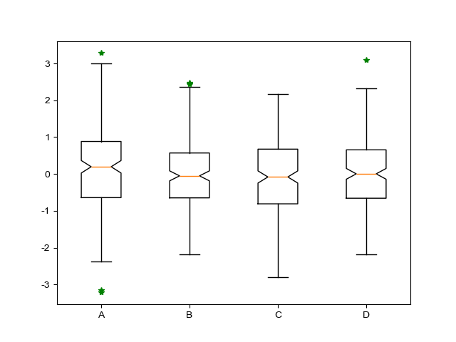
箱形图是一种用作显示一组数据分散情况资料的统计图,因形状如箱子而得名。常用于品质管理,快速识别异常值。它最大的优点是不受异常值的影响,能够准确地描绘出数据的离散分布情况,有利于数据的清洗。同时也能展现出一组数据的最大值、最小值、中位数及上下四分位数
异常值:
若 $$ n > (Q3 - Q1) * 1.5 + Q3 $$ 或 $$ n < Q1 - (Q3 - Q1) * 1.5 $$ 则称n为异常值,其中(Q3 - Q1)叫做四分位距
绘图:
# 导包
import pandas as pd
import numpy as np
import matplotlib.pyplot as plt
# 让图片可以显示中文
plt.rcParams['font.sans-serif'] = 'Arial Unicode MS'
# 让图片可以显示负号
plt.rcParams['axes.unicode_minus'] = False

# 数据准备
x = np.random.normal(size = (200, 4))
labels = ['A', 'B', 'C', 'D']

# 绘图
plt.boxplot(
        x,
        labels = labels, # 标签
        notch = True ,# 箱形图样式
        sym = 'g*' # 颜色和marker
)
plt.show()
5.散点图
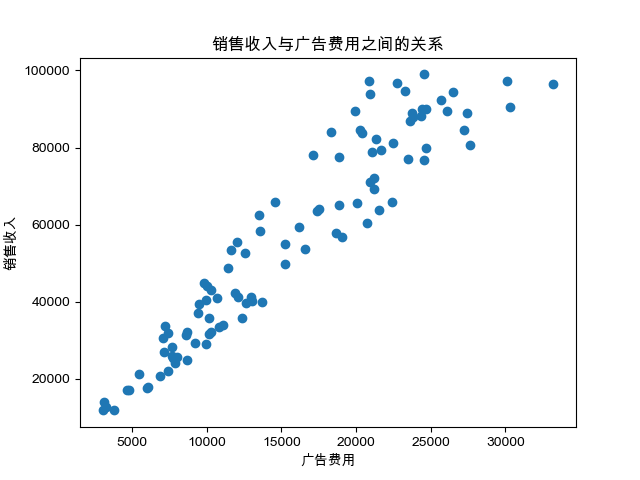
散点图用于在水平轴和垂直轴上绘制数据点,它表示了因变量随自变量变化的趋势。通俗地讲,它反映的是一个变量受另一个变量的影响程度
散点图绘制:
import pandas as pd
import numpy as np
import matplotlib.pyplot as plt
# 让图片可以显示中文
plt.rcParams['font.sans-serif'] = 'Arial Unicode MS'
# 让图片可以显示负号
plt.rcParams['axes.unicode_minus'] = False

data = pd.read_excel('data/plot.xlsx', sheet_name = 'scatter')
x = data.广告费用
y = data.销售收入
plt.scatter(x, y)
plt.xlabel('广告费用')
plt.ylabel('销售收入')
plt.title('销售收入与广告费用之间的关系')
plt.show()
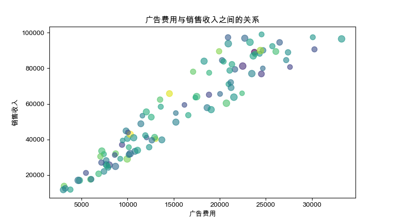
气泡图绘制:
# 导包
...

# 读取数据
data = pd.read_excel('data/plot.xlsx', sheet_name = 'scatter')
data
x = data.广告费用
y = data.销售收入

# 绘图
plt.figure(figsize = (8, 4.5))
s = np.random.randint(50, 100, 100) #
c = np.random.randn(100) #
plt.scatter(x, y, c = c, s = s, alpha = 0.6)
plt.title('广告费用与销售收入之间的关系')
plt.xlabel('广告费用')
plt.ylabel('销售收入')
plt.show()
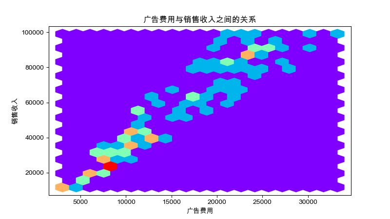
六边形图绘制:hexbin函数
# 六边形图
# 绘图
plt.figure(figsize = (8, 4.5))
s = np.random.randint(50, 100, 100)
c = np.random.randn(100)
# hexbin函数
plt.hexbin(x, y, gridsize = 20, cmap = 'rainbow')
plt.title('广告费用与销售收入之间的关系')
plt.xlabel('广告费用')
plt.ylabel('销售收入')
plt.savefig('/Users/edward/PrjFile/JupyterNoteBook/Matplotlib/image/image21.png')
plt.show()
6.饼图
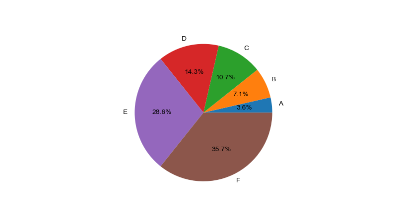
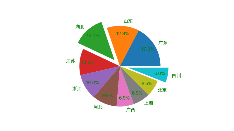
饼状图用来显示一个数据体系,具体来说,饼状图显示一个数据系列中各项目占项目总和的百分比
简单绘制:
# 导包
import pandas as pd
import numpy as np
import matplotlib.pyplot as plt
# 让图片可以显示中文
plt.rcParams['font.sans-serif'] = 'Arial Unicode MS'
# 让图片可以显示负号
plt.rcParams['axes.unicode_minus'] = False

x = [10,20,30,40,80,100]
labels = ['A', 'B', 'C', 'D', 'E', 'F']
plt.figure(figsize = (8, 4.5))
# autopct的参数:控制饼图上百分比文本的显示 .0f 不显示小数  .1f 显示一位小数 ...
plt.pie(x, autopct='%.1f%%', labels = labels)
plt.show()
完整绘制:
# 读取数据
df = pd.read_excel('data/plot.xlsx', sheet_name = 'pie1')
province = df.省份
value = df.销量

# 绘图
plt.figure(figsize = (8, 4.5))
plt.pie(
    value,
    autopct = '%.1f%%',
    pctdistance = 0.8, # 百分比距离圆心的位置[0, 1],越接近1,距离越远
    labels = province, # 标签,用于区分不同的扇形含义
    labeldistance = 1.1, # 标签距离圆心的位置
    # shadow = True, # 阴影
    textprops = {'fontsize' : 12, 'color' : 'g'}, # 文字设置
    # 分裂效果 参数表示距离圆心的距离,默认为0
    explode = [0, 0, 0.2, 0, 0, 0, 0, 0, 0, 0.2]
)

plt.show()
圆环图:
# 数据准备
df1 = pd.read_excel('data/plot.xlsx', sheet_name = 'pie1')
df2 = pd.read_excel('data/plot.xlsx', sheet_name = 'pie2')
city1, city2 = df1.省份, df2.省份
value1, value2 = df1.销量, df2.销量

# 绘图
plt.figure(figsize = (16, 8))
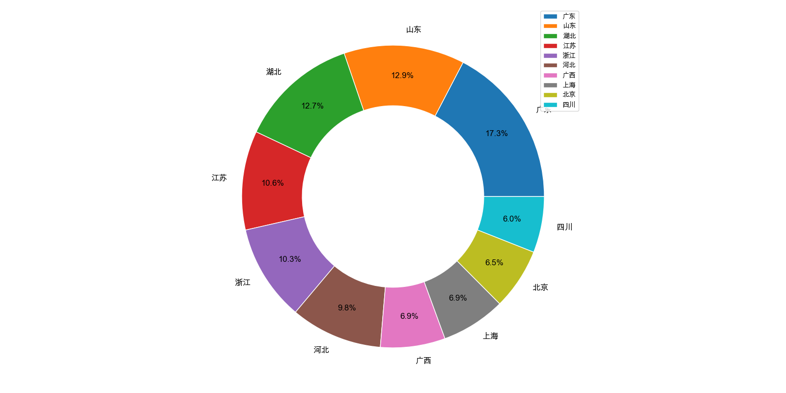
plt.pie(value1,
        labels = city1,
        autopct = '%.1f%%',
        # 设置圆环的宽度和边缘颜色
        wedgeprops = {'width' : 0.4, 'edgecolor' : 'w'},
        pctdistance = 0.8,
        textprops = {'fontsize' : 12}
       )

plt.legend()
plt.tight_layout()
plt.savefig('/Users/edward/PrjFile/JupyterNoteBook/Matplotlib/image/image24.png')
plt.show()
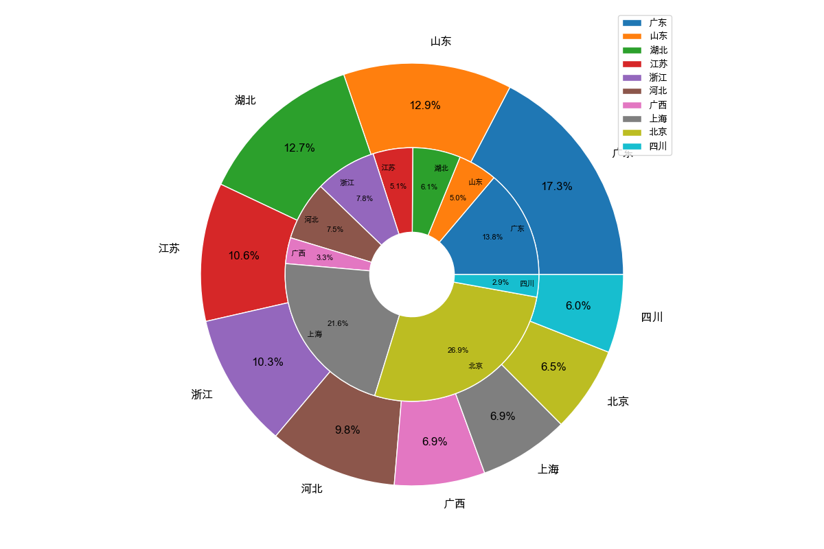
在圆环图的基础上,可以绘制出多圆环图:
# 多个圆环
df1 = pd.read_excel('data/plot.xlsx', sheet_name = 'pie1')
df2 = pd.read_excel('data/plot.xlsx', sheet_name = 'pie2')
city1, city2 = df1.省份, df2.省份
value1, value2 = df1.销量, df2.销量

plt.figure(figsize = (12, 8))
plt.pie(value1,
        labels = city1,
        autopct = '%.1f%%',
        wedgeprops = {'width' : 0.4, 'edgecolor' : 'w'},
        pctdistance = 0.8,
        textprops = {'fontsize' : 12}
       )

plt.legend() # 图例写到这里是因为两个数据的标签相同,防止出现重复标签

plt.pie(value2,
        labels = city2,
        autopct = '%.1f%%',
        pctdistance = 0.7,
        radius = 0.6,
        textprops = {'fontsize' : 8},
        labeldistance = 0.85,
        wedgeprops = {'width' : 0.4, 'edgecolor' : 'w'}
       )

plt.tight_layout()
plt.savefig('/Users/edward/PrjFile/JupyterNoteBook/Matplotlib/image/image25.png')
plt.show()
7.面积图
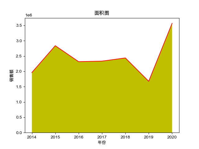
面积图又称区域图,和折线图类似,强调y轴随x轴而变化的程度,可以用于人们对总趋势的注意
# 导包
import pandas as pd
import numpy as np
import matplotlib.pyplot as plt
# 让图片可以显示中文
plt.rcParams['font.sans-serif'] = 'Arial Unicode MS'
# 让图片可以显示负号
plt.rcParams['axes.unicode_minus'] = False

# 准备数据
data = pd.read_excel('data/plot.xlsx', sheet_name = 'stackplot1')
x = data.年份
y = data.销售额

# 绘图
plt.stackplot(x, y, colors = 'yellow')
plt.plot(x, y, c = 'r')
plt.xlabel('年份')
plt.ylabel('销售额')
plt.title('面积图')
plt.savefig('/Users/edward/PrjFile/JupyterNoteBook/Matplotlib/image/image26.png')
plt.show()
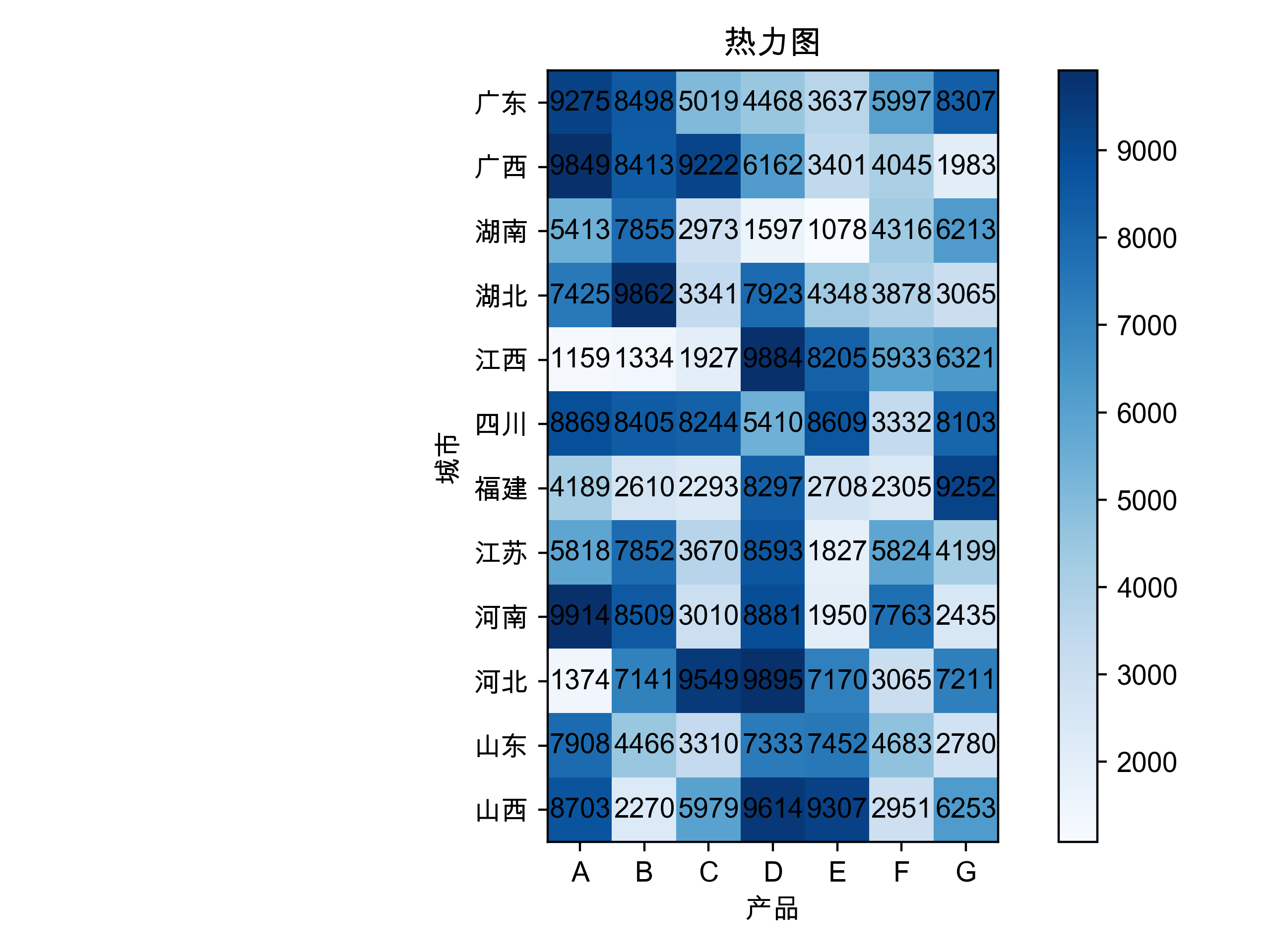
8.热力图
热力图是一种通过对色块着色来显示数据的统计图表。绘图时,需要指定颜色映射的规则
# 导包
import pandas as pd
import numpy as np
import matplotlib.pyplot as plt
# 让图片可以显示中文
plt.rcParams['font.sans-serif'] = 'Arial Unicode MS'
# 让图片可以显示负号
plt.rcParams['axes.unicode_minus'] = False

df = pd.read_excel('data/plot.xlsx', sheet_name='imshow)

# 准备数据
x_tick = df.drop(columns = '省份').columns
y_tick = df.省份
data = df.drop(columns = '省份').values

# 绘图
plt.imshow(data ,cmap = 'Blues')
plt.xlabel('产品')
plt.ylabel('城市')
plt.xticks(range(len(x_tick)), ['A', 'B', 'C', 'D', 'E', 'F', 'G'])
plt.yticks(range(len(y_tick)), y_tick)
plt.title('热力图')
plt.tight_layout()

# 循环显示数值
for i in range(len(x_tick)):
    for j in range(len(y_tick)):
        plt.text(
            x = i,
            y = j,
            s = data[j ,i],
            ha = 'center',
            va = 'center',
            fontsize = 10
        )

# 显示颜色条
plt.colorbar()
plt.show()
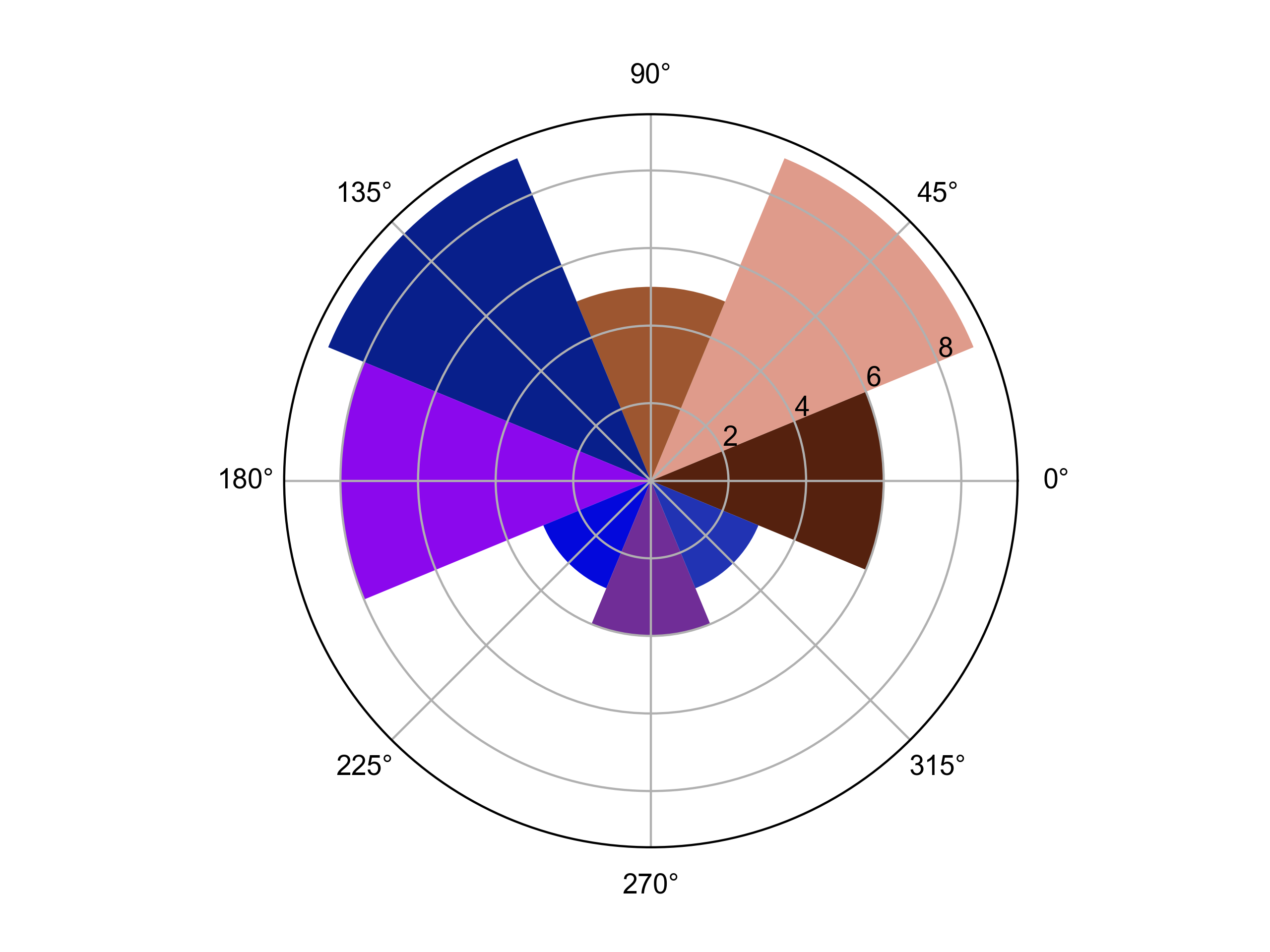
9.极坐标图
极坐标图是一个二维坐标系统,该坐标系统中任意位置可由一个夹脚和一段相对原点一极点的距离来表示
# 导包
import pandas as pd
import numpy as np
import matplotlib.pyplot as plt
# 让图片可以显示中文
plt.rcParams['font.sans-serif'] = 'Arial Unicode MS'
# 让图片可以显示负号
plt.rcParams['axes.unicode_minus'] = False

N = 8 # 等分成8份
width = 2 * np.pi / N
color = np.random.rand(8, 3)

x = np.linspace(0, 2 * np.pi, N, endpoint = False)
height = np.random.randint(3, 15, size = N)

axes = plt.subplot(111, projection = 'polar') # 'polar' 极坐标
axes.bar(x = x, height = height, width = width, bottom = 0, color = color)

plt.savefig('image/img27.png', dpi = 400)
plt.show()
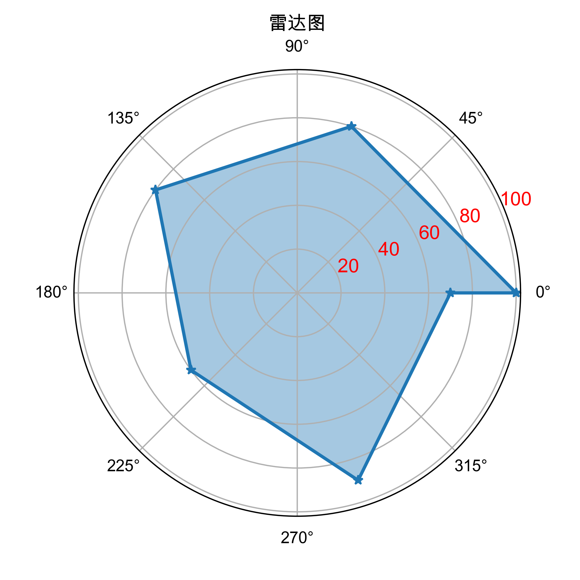
10.雷达图
雷达图是从同一点开始的轴上表示的三个或更多个变量的二维图表的形式显示多变量数据的图形方法\
# 导包
import pandas as pd
import numpy as np
import matplotlib.pyplot as plt
# 让图片可以显示中文
plt.rcParams['font.sans-serif'] = 'Arial Unicode MS'
# 让图片可以显示负号
plt.rcParams['axes.unicode_minus'] = False

# 准备数据
x = np.linspace(0, 2 * np.pi, 6, endpoint = 'False')
y = [100, 80, 80, 60, 90, 70]

# 首尾相连
x = np.concatenate((x, [x[0]]))
y = np.concatenate((y, [y[0]]))

# 绘图
plt.figure(figsize = (5, 5))
axes = plt.subplot(111, polar = True)
axes.plot(x, y, marker = '*' , lw = 2)
# 面积填充
axes.fill(x, y, alpha = 0.4)
# 显示刻度(函数默认自动生成刻度,但我们可以根据set_rgrid()方法修改刻度参数)
axes.set_rgrids([20, 40, 60, 80, 100], fontsize = 12, c = 'r')
plt.title('雷达图')
plt.savefig('image/img28.png', dpi = 400)
plt.show()
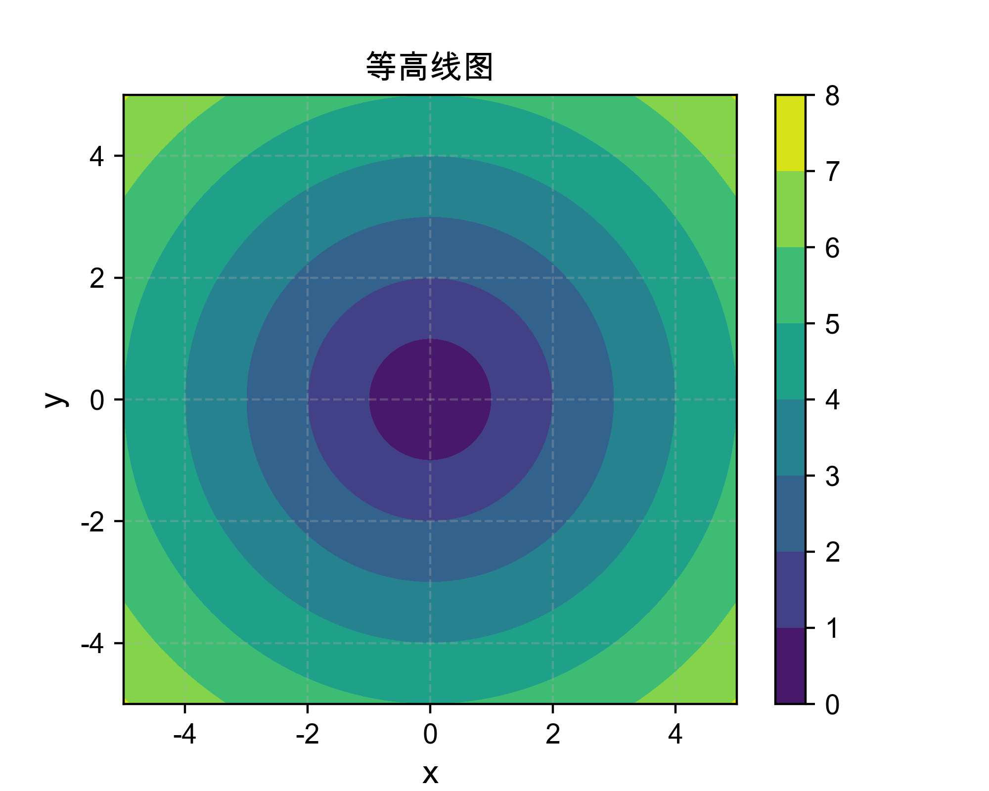
11.等高线图
等高线图也称水平图,是一种在二维平面显示3D图像的方法
# 导包
import pandas as pd
import numpy as np
import matplotlib.pyplot as plt
# 让图片可以显示中文
plt.rcParams['font.sans-serif'] = 'Arial Unicode MS'
# 让图片可以显示负号
plt.rcParams['axes.unicode_minus'] = False

# 数据准备
x = np.linspace(-5, 5, 100)
y = np.linspace(-5, 5, 100)

# 将x,y转为二维网格,用来构建二维平面的每个点坐标
X, Y = np.meshgrid(x, y)
# 对网格中的每个点(x, y)计算到原点的距离,Z表示每个点的‘高度’或‘强度’值
Z = np.sqrt(X**2 + Y**2)

# 绘图
plt.figure(figsize = (5, 4))
cb = plt.contourf(X, Y, Z)
plt.colorbar(cb)

plt.xlabel('x', fontsize = 12)
plt.ylabel('y', fontsize = 12)
plt.title('等高线图')
plt.grid(True, linestyle = '--', alpha = 0.3)
plt.savefig('image/img29.png', dpi = 400)
plt.show()
12.3D图
...推荐学习Pyecharts
13.图像处理
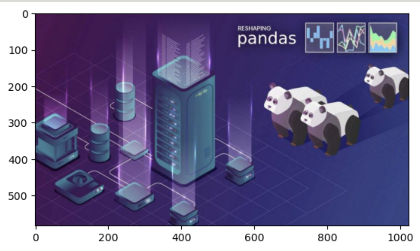
- 读取图片
- 显示图片
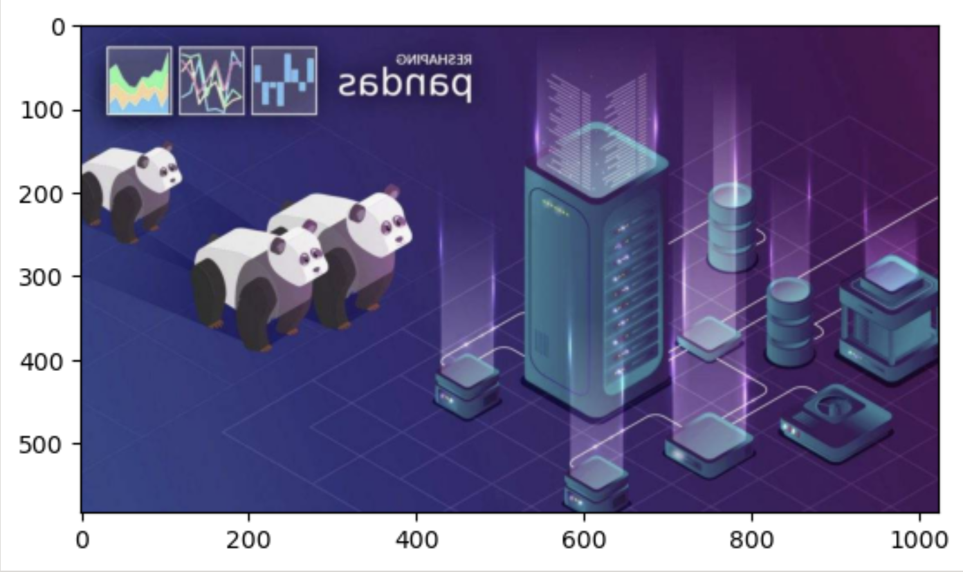
- 图片操作_水平翻转
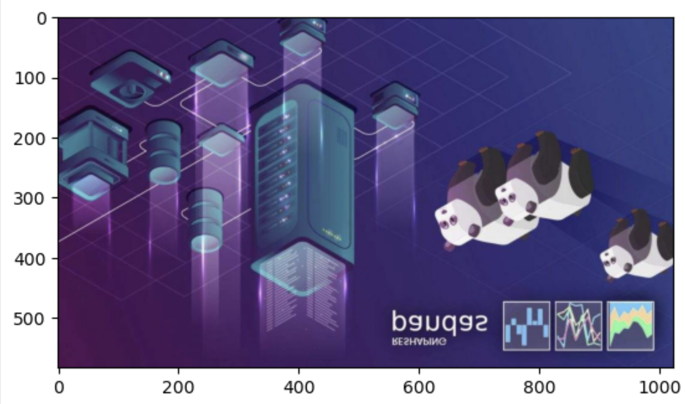
- 图片操作_垂直翻转
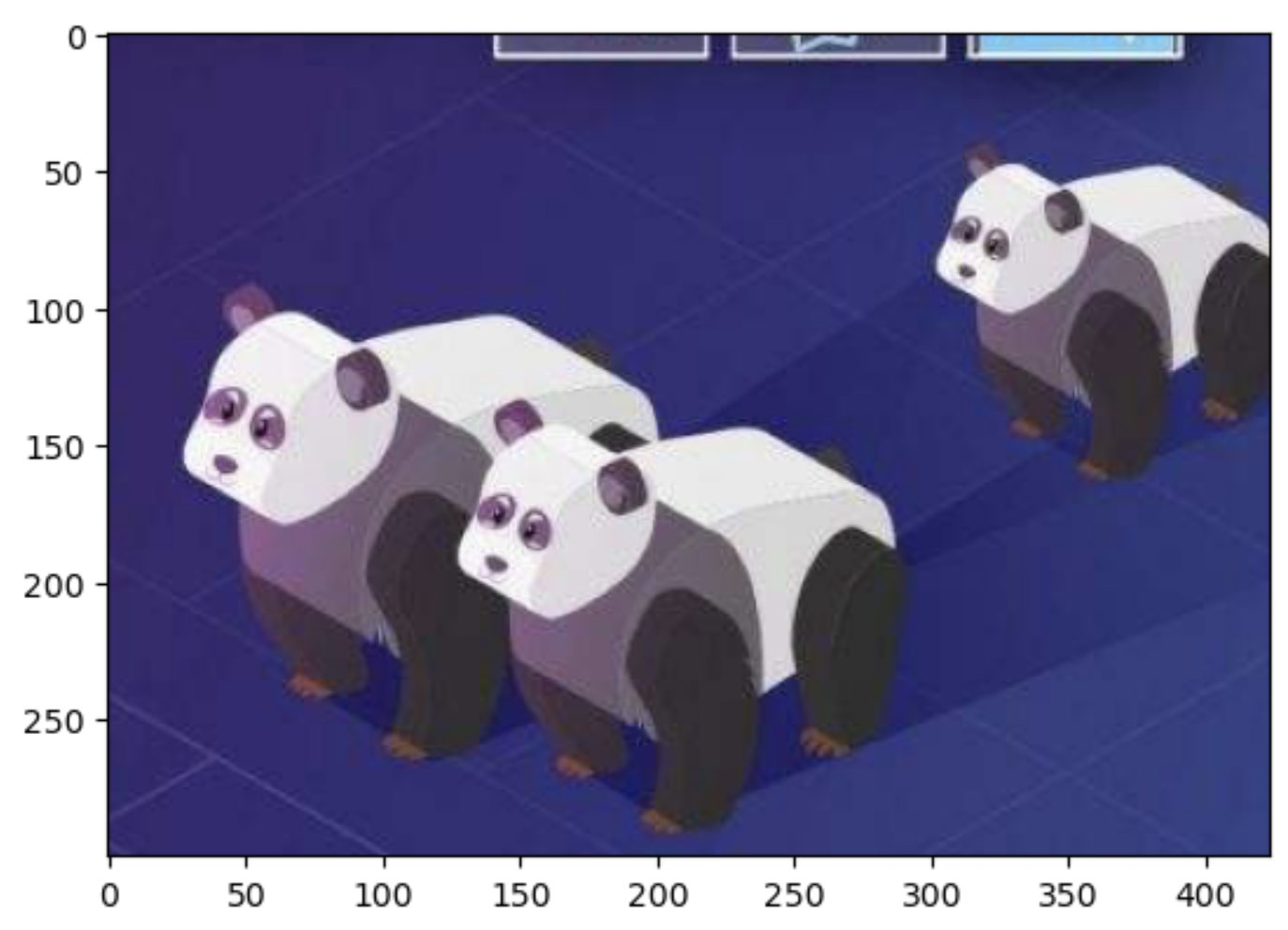
- 图片的切片
- 保存图片